Colors
A guide to working with the Tetrisly Colors.
Overview
Colors in the user interface are a very important foundation in terms of well-readable content and hierarchy. They not only represent your brand but also play an essential role in how your designs look and feel. Color supports the purpose of the content, communication, and information architecture.
Each color has an assigned role, which keeps a specific meaning based on its function. Our colors were designed with well contrast ratio, pleasant appearance, and what is important - the smart system that allows you to change just a few major colors with propagation to other colors like action, states, or feedback components.
We have defined the alias group named "Semantic Colors" for better and easier control of the colors in the whole library. Changing the color values in this group is propagated to other aliases.
Features
Unique naming system. Our system allows you to add new shades after or before the base color,
which, at the very end, includes the number “0” - for instance: $blue-0.
Color Tokens and Aliases. Tetrisly Colors provides a propagation system that allows you to inherit the value from one color token to another. Changing the semantic color from green to blue will keep you proper accessibility and values, but moreover, it will propagate into the rest of the colors token using this semantic.
Colors follow accessibility guidelines. The whole range of colors is scalable and consistent, so they all shine the same way. Each color is prepared based on WCGA standards with a completed contrast ratio test.
Understanding: Color system
The color scheme is based on 16 key colors (called Global), each associated with its own 13 shades. Specific tones are assigned across a whole interface, creating a multi-tree directory for particular components, text, background, etc.
The below diagram represents the hierarchy and propagations in Tetrisly Design System:
Non-semantic / Grey colors are related to Semantic / Neutral to guarantee a change in Semantic
colors will propagate the same grey in the whole Interface.
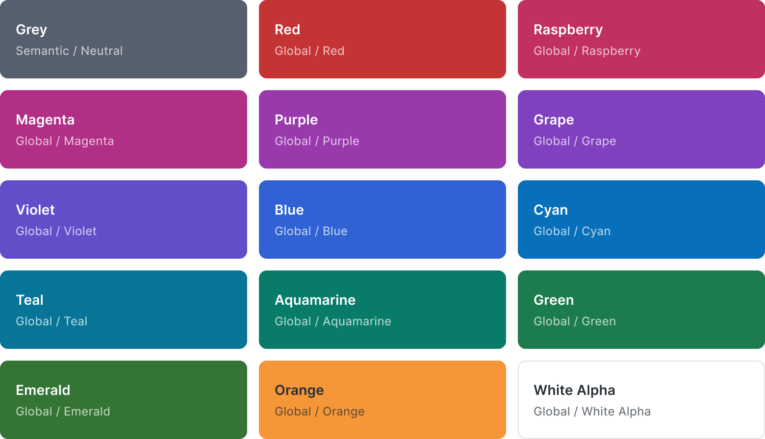
Global colors
This color palette is the foundation for creating any interface in our Design System with premade shades (tints and shades) for each of the 16 key colors.
All Color Tokens used in Tetrisly are avaiable here: Color Tokens
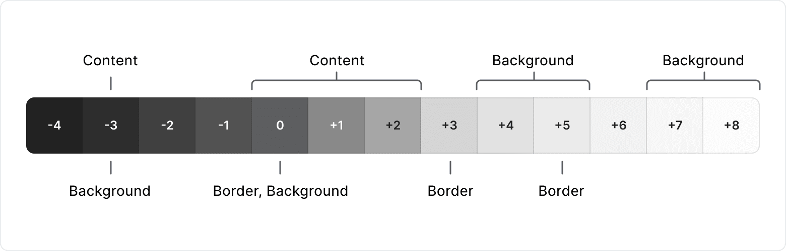
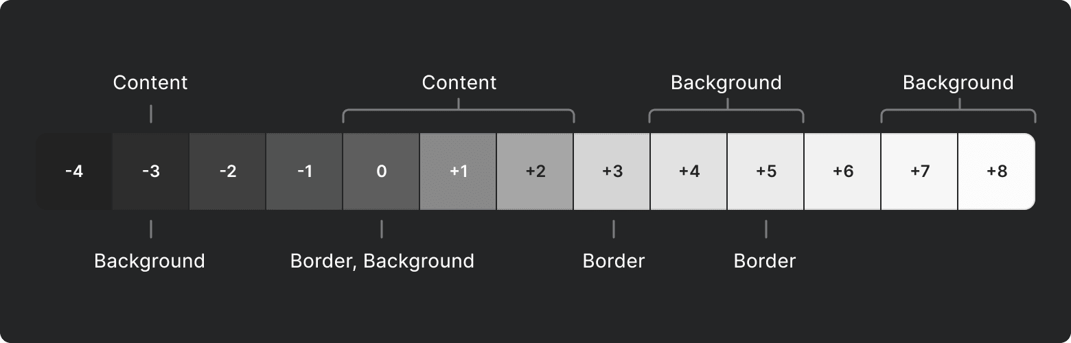
Color Steps
The colors' shades values aren't random, there is our own color system and algorithm behind them. Each color shade has at least one specific use case. The shade value is strictly connected with other shades and usage contexts to ensure accessibility and consistency in the whole design system. Our color system ensures reaching the look & feel without fail.
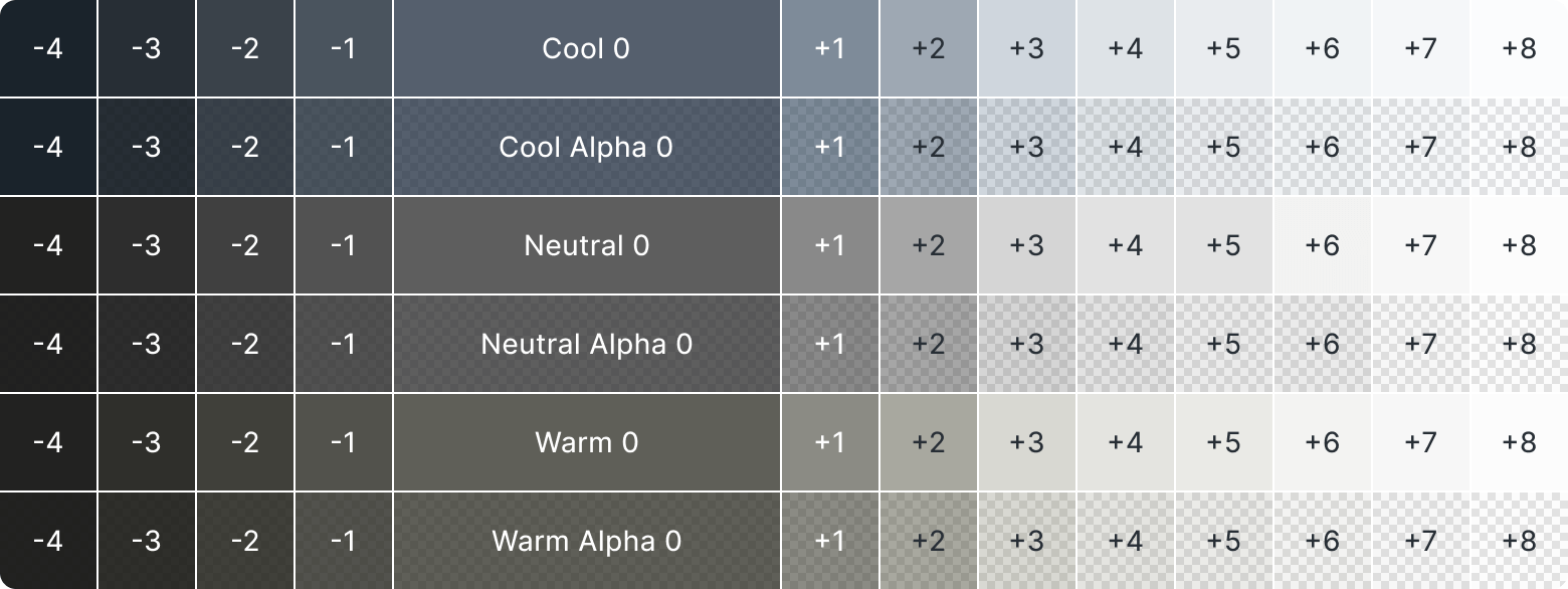
Grayscale
Included three grey's temperatures: Cool Grey, Neutral Grey and Warm Grey
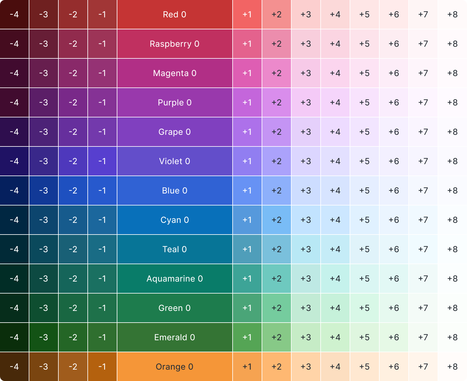
Colors
Included all colorful colors: Red, Raspberry, Magenta, Purple, Grape, Violet, Blue,
Cyan, Teal, Aquamarine, Green, Emerald, and Orange.
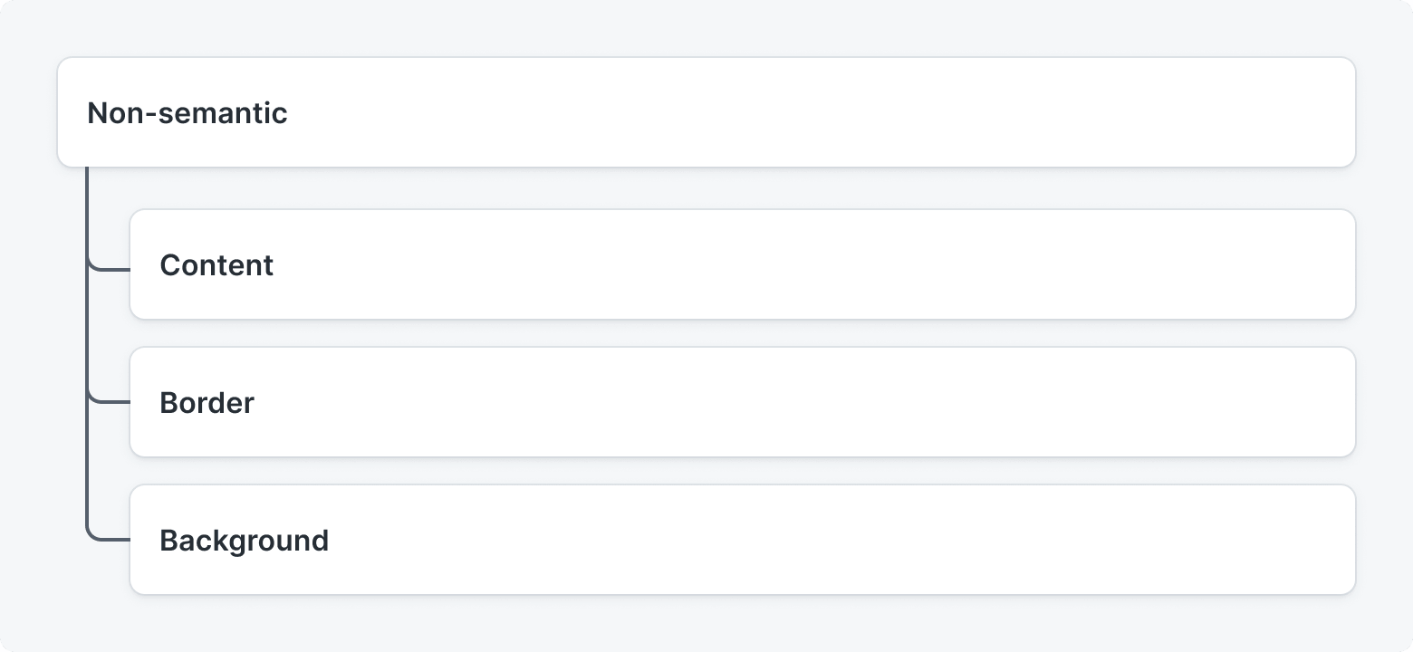
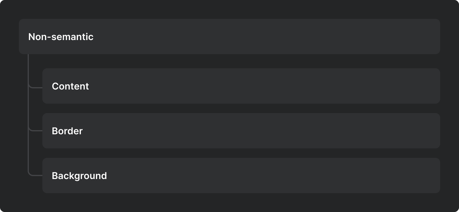
Non-semantic
Color Tokens
Color Tokens are part of Design Tokens. We defined Color Tokens based on the role they play in the interface.
Color Token is a semantic representation of the color that helps understand how or when the token should be used. It helps to limit design decisions and place them in specific contexts.
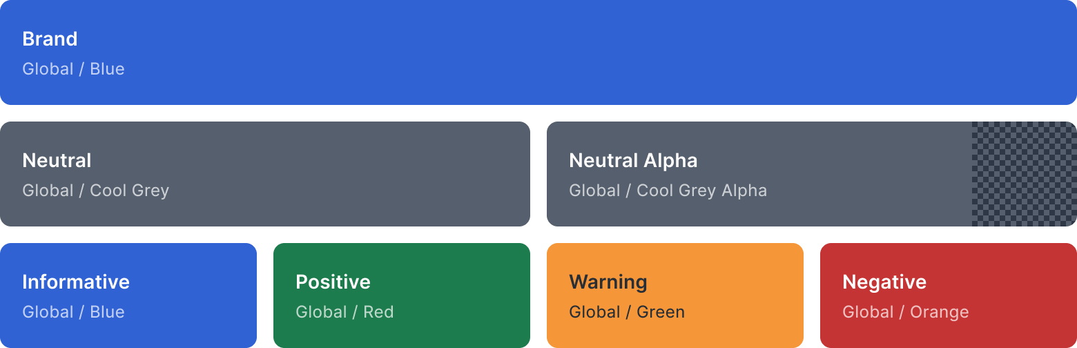
Semantic color tokens
We separated semantic groups which are crucial to our system. You are able to change just a few groups to define all inherit:
- Brand Color - the primary color used across all interactive elements such as buttons, links, or tabs.
- Neutral Color - used in almost all components such as forms, text, dividers, or backgrounds. Usually, it is the grey color that is an important determinant of how your design looks and feels. This color is also used for neutral feedback without any specific context.
- Informative Color - used for communicating informational feedback. It's more important than Neutral Color.
- Positive Color - used to communicate a positive action, successful confirmation, or positive feedback. If your brand color is green, consider changing Positive Color.
- Warning Color - used to display information that needs more attention or that users need to take action on.
- Negative Color - used to communicates something negative. Is used in each destructive action, error state, or negative feedback such as a removing file from the library.
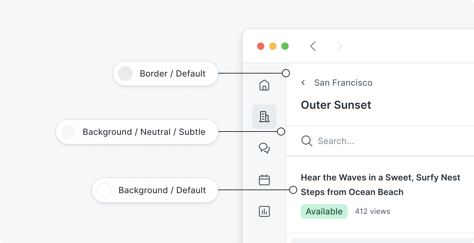
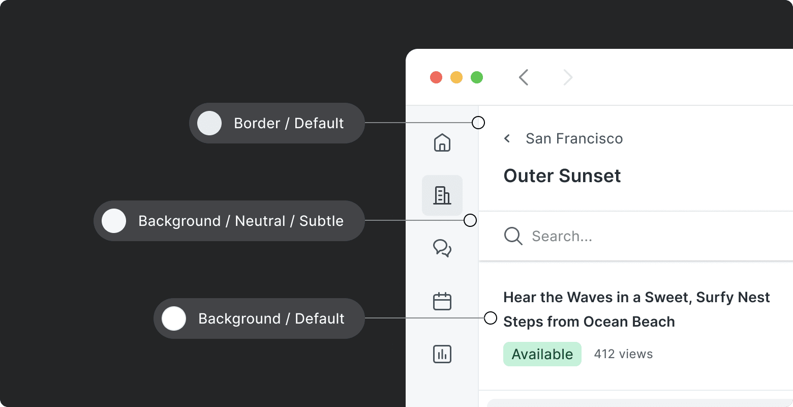
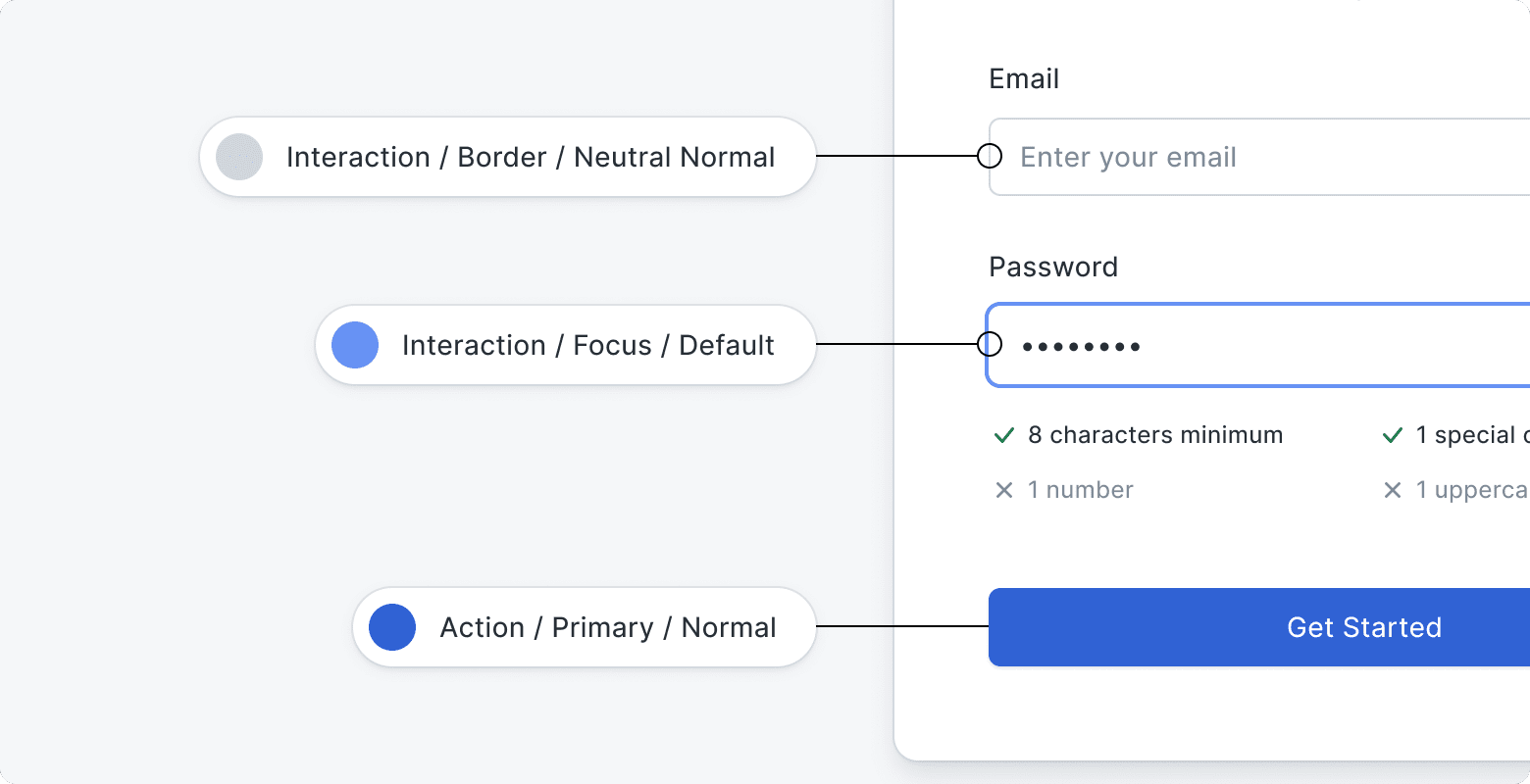
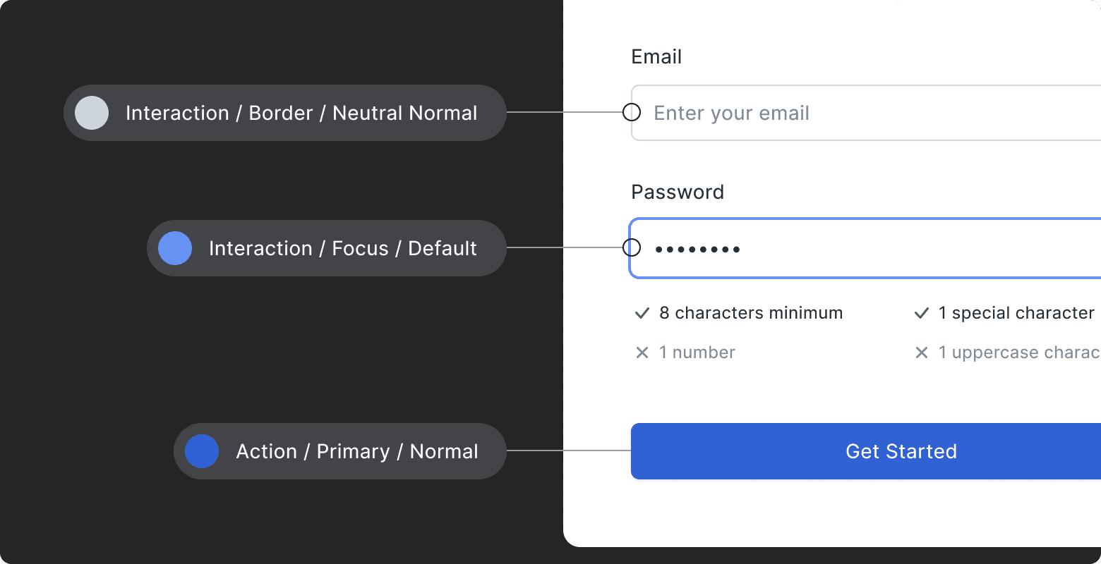
Contextual color tokens
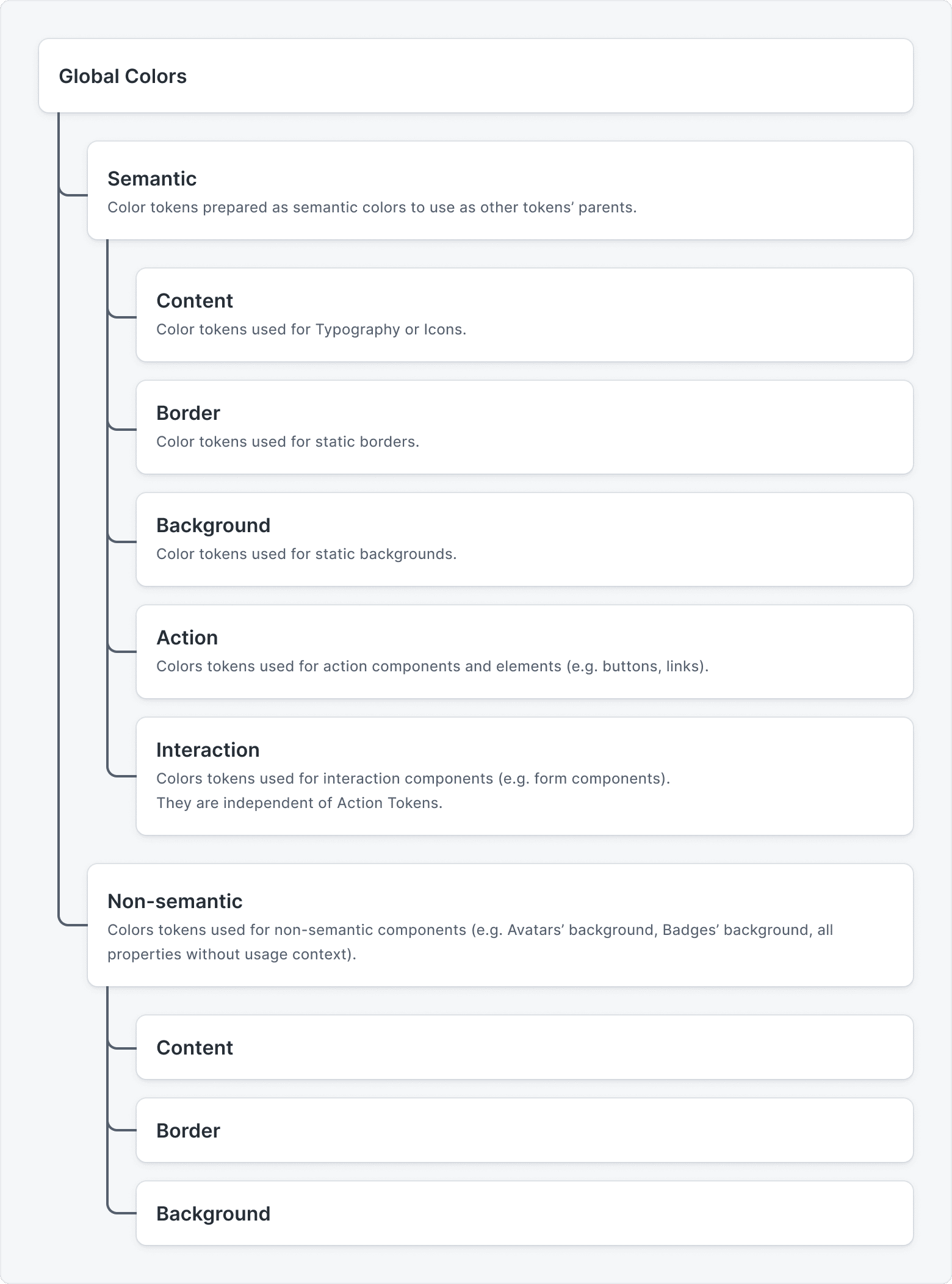
Then, we have more contextual groups which are used in specific components or elements across the whole UI.
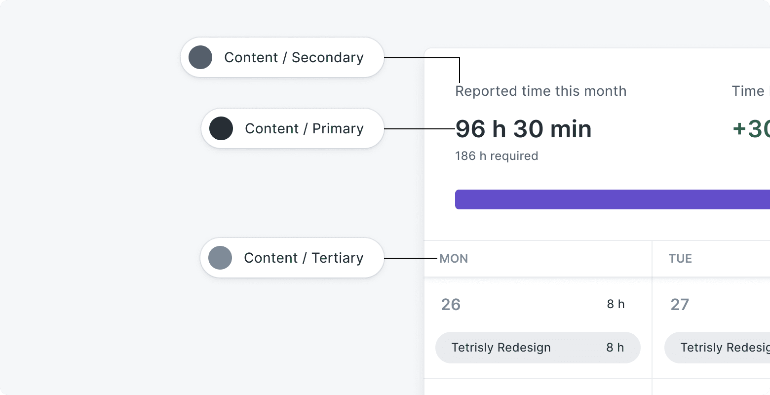
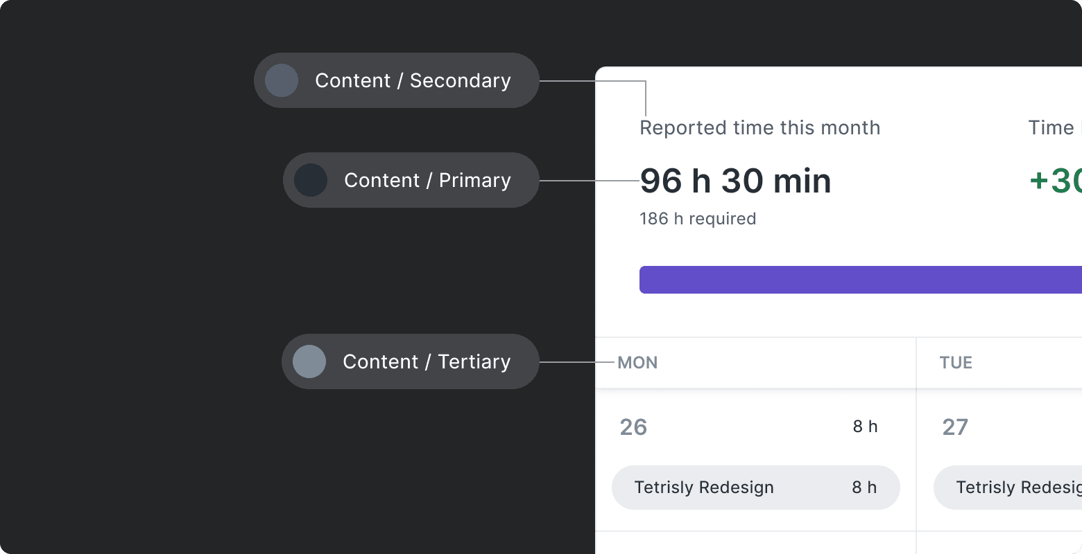
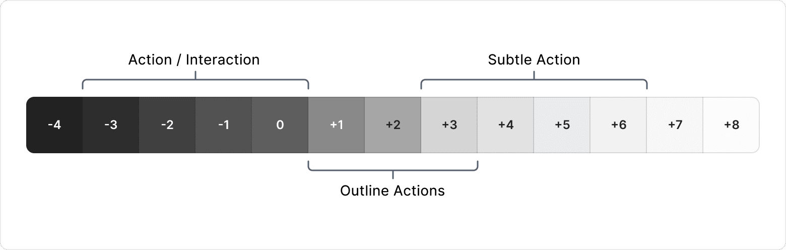
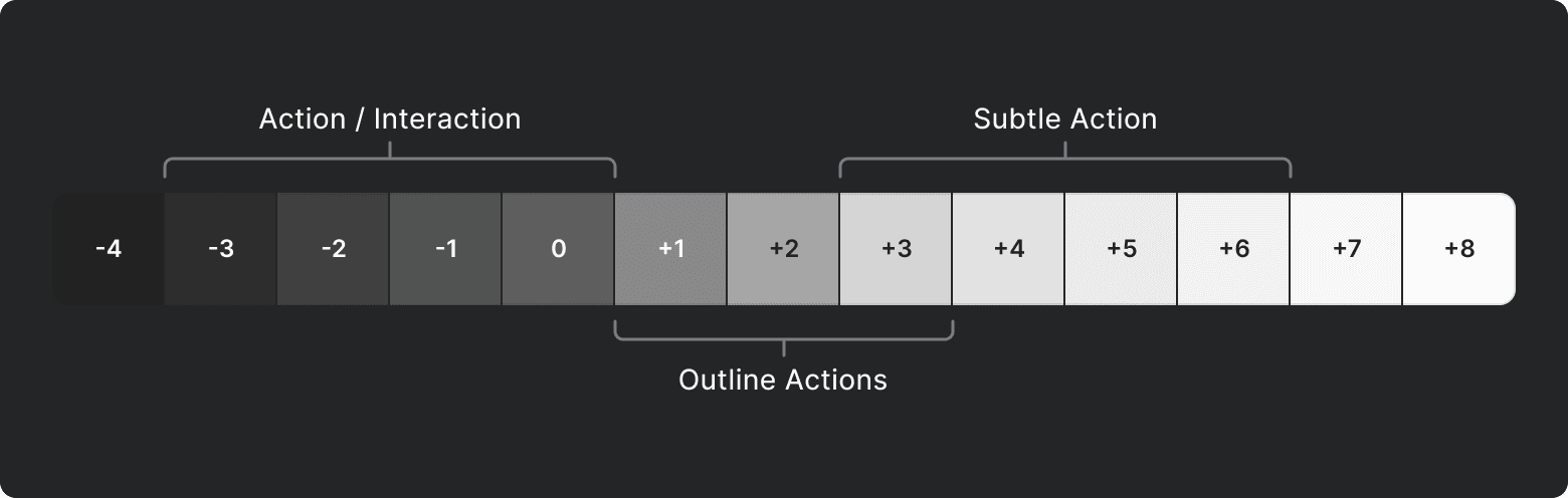
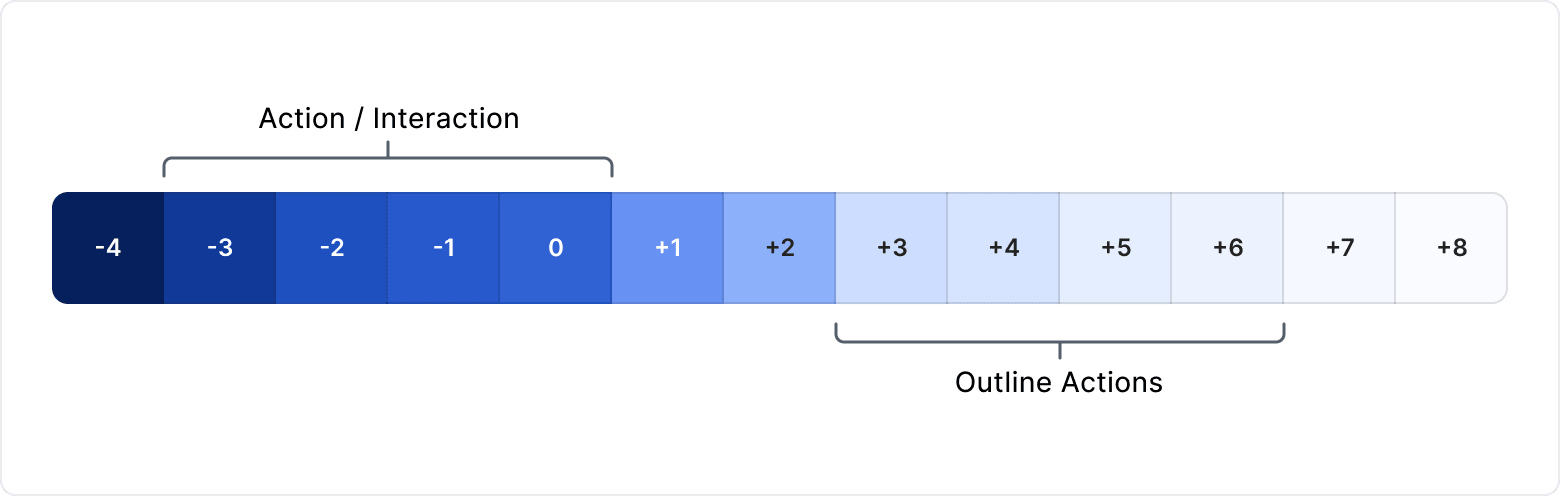
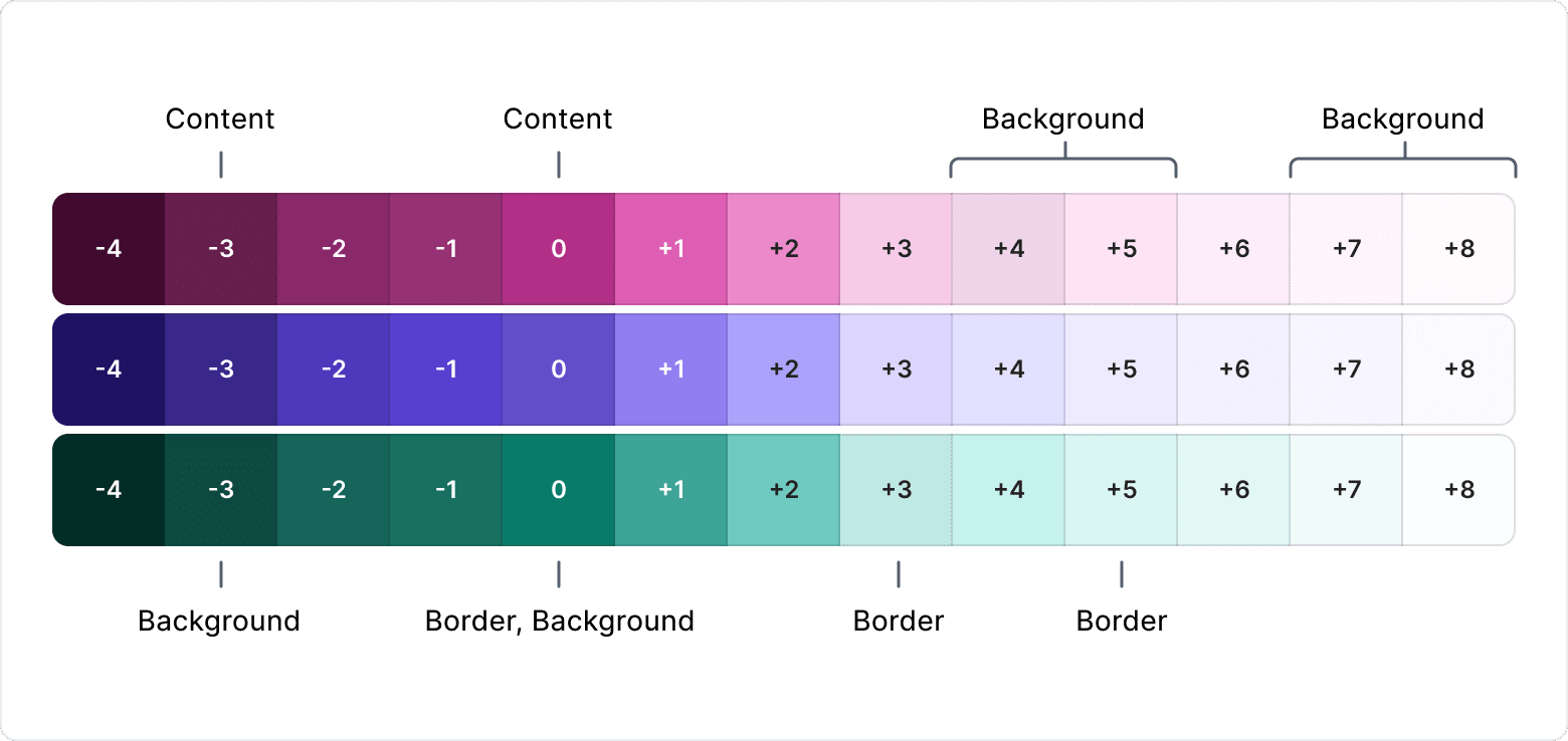
- Content - used for Typography or Icons
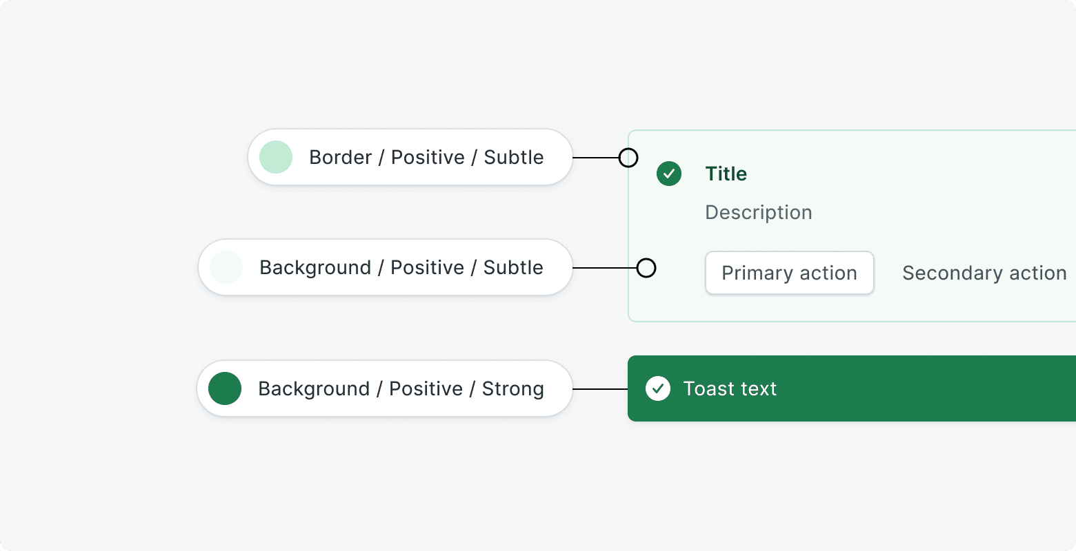
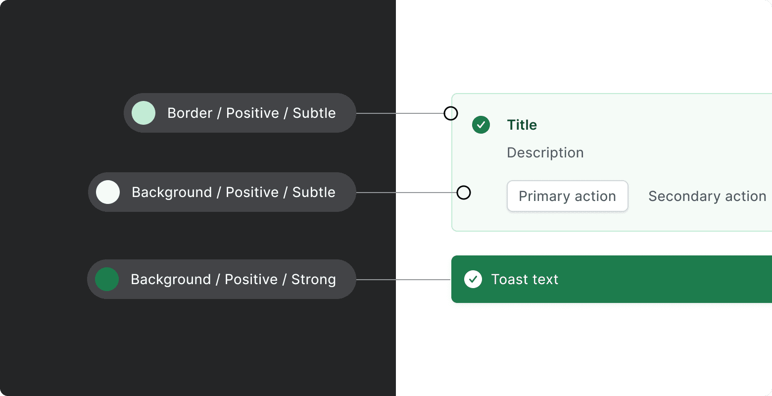
- Border - used for static borders (e.g.
neutral) - Background - used for static backgrounds
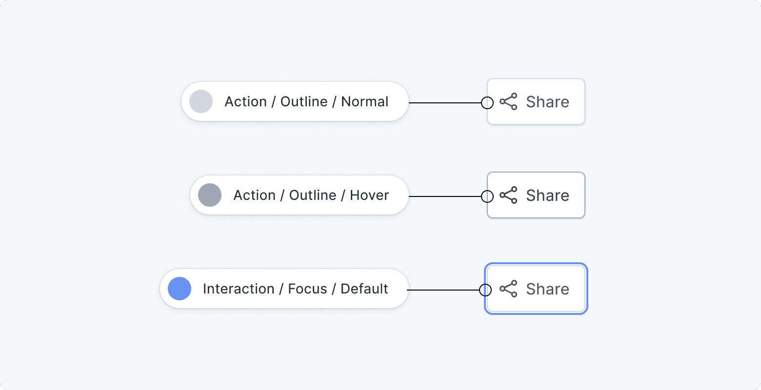
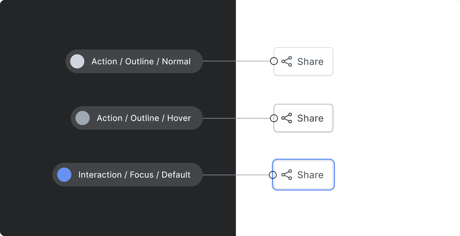
- Action - used for action components and elements (e.g.
buttons,links). - Interaction - used for interaction components (e.g.
form components). They are independent of Action Tokens.
Non-semantic Color Tokens
Set of colors tokens used for Non-semantic components (e.g. Avatars background,
Badges background, all components without usage context).
Non-semantic colors are grouped analogically as semantic colors by usage contexts such as content, border, and background to better guide where to assign them.
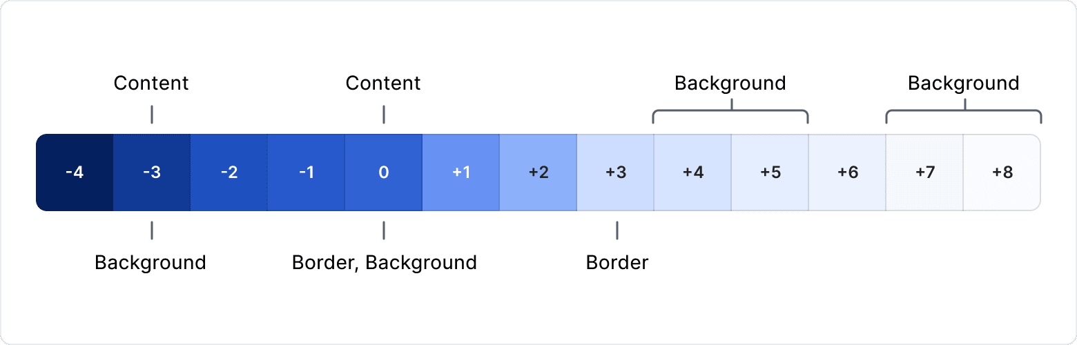
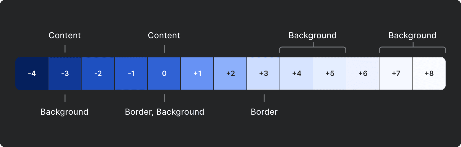
Alias Tokens
Alias tokens relate to a specific context or abstraction. Aliases help communicate the intended purpose of a token, and are effective when a value with a single intent appears in multiple places.
Below illustrations present the propagation of the value from raw units (HEX/RGB) to the proper Color Alias.
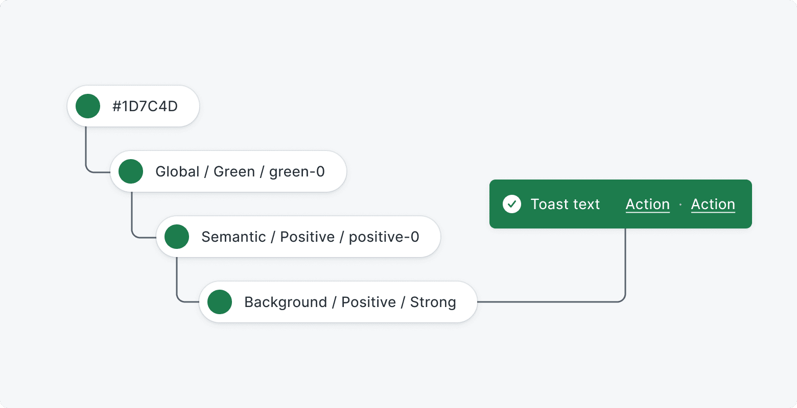
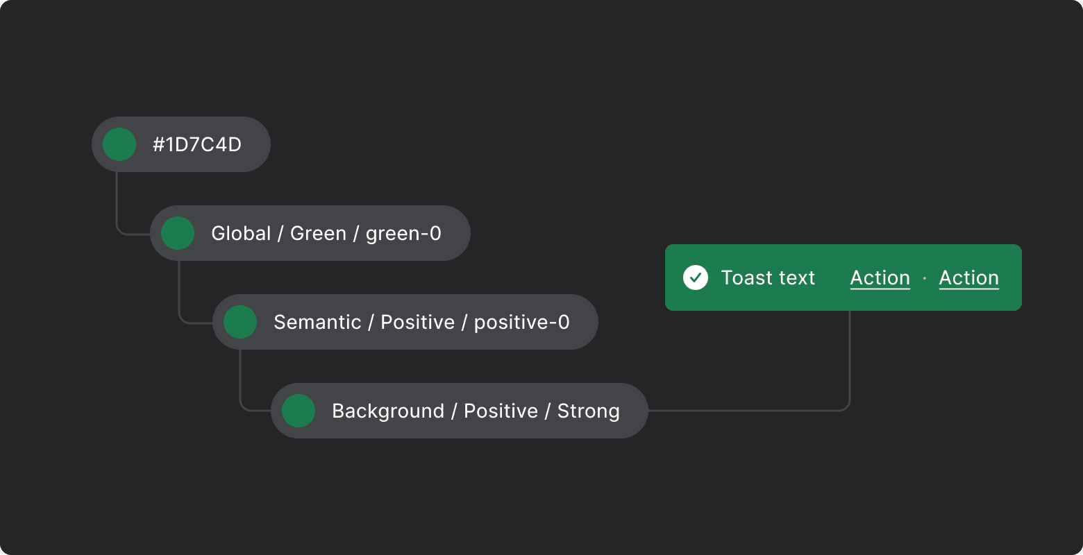
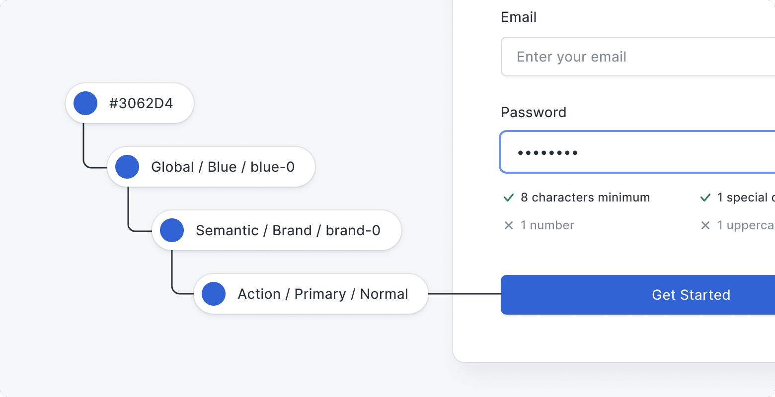
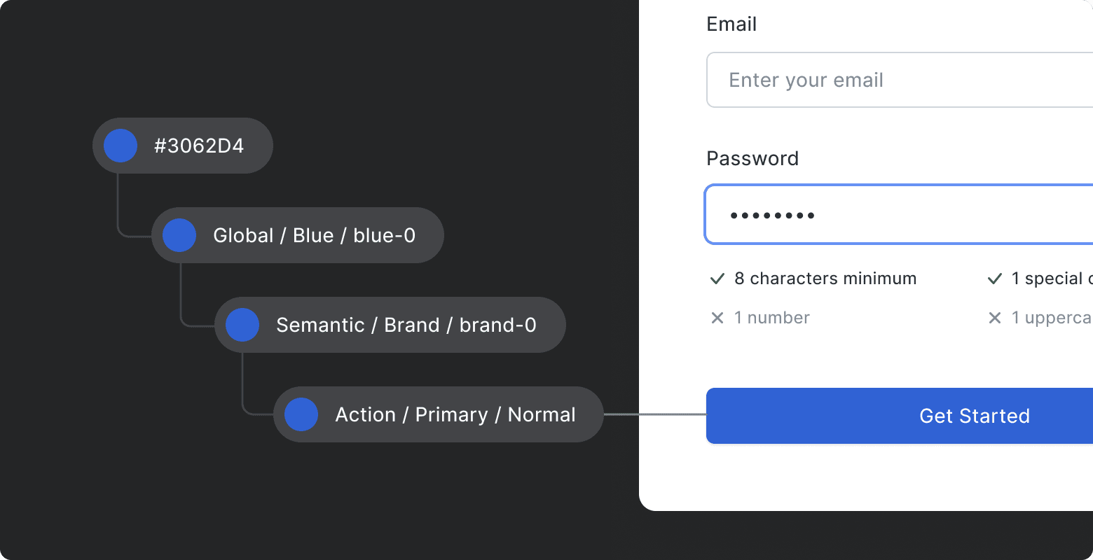
Colors in action
Let’s take a look at color tokens used in proper components, and how they’re applied across the interface.