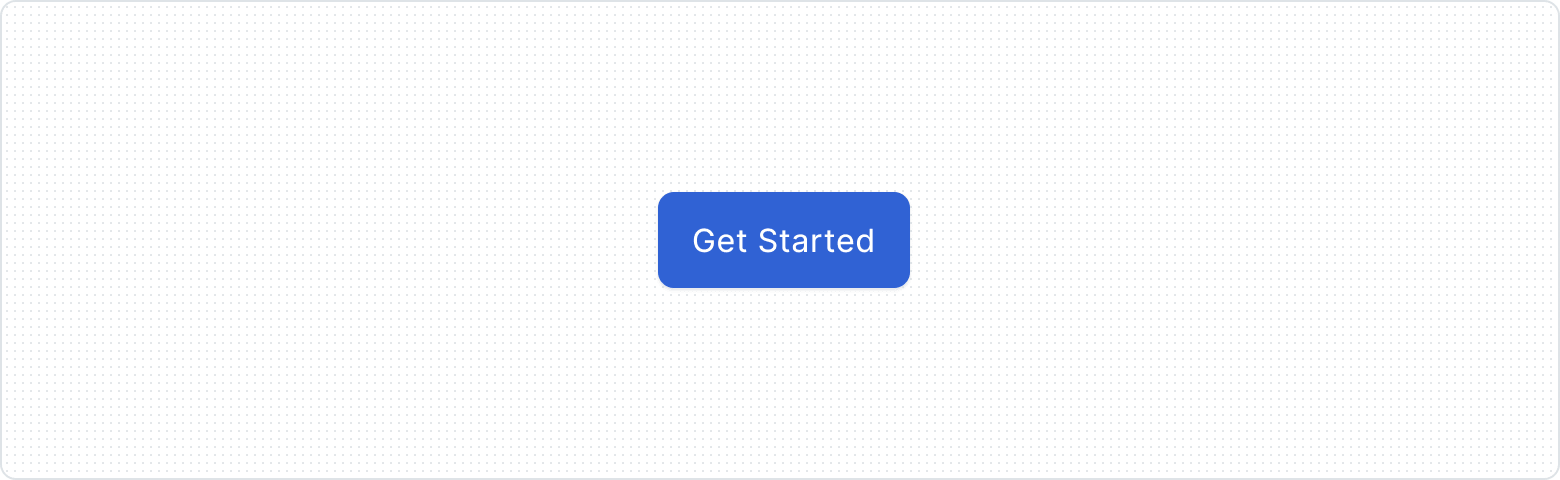
Button
A versatile and interactive element. Buttons allow users to perform actions and navigate through an application. They come in various styles and sizes, providing clear visual cues and feedback to users.
Key Features
- Clear purpose
The visual design reflects the button's intended functionality, ensuring users understand the action it will trigger.
- Interactive feedback
Responsive feedback for different interaction states, reassuring users of its functionality.
- Accessibility-Friendly
Following best practices, our button supports diverse user abilities and preferences through proper contrast, text size, and focus indicators.
- Consistent experience
The component delivers a consistent behavior across platforms and devices, aligned with the brand and promoting a cohesive user experience.
Variants
By providing diverse options, we ensure that components can be tailored to fit different contexts, requirements, and design preferences. Understanding and leveraging these options will help you create a more engaging and adaptable user interface for your website or application.

The different Types provide a visual representation of the button that you can use according to your UI needs.

The Appearance is strictly related to the hierarchy of the buttons. It is crucial to choose the proper Appearance depending on the importance of the action the button implies.

The intent of the button is to provide clear semantic information: none (default actions), success (positive outcomes), and destructive (caution-required actions).

Size property adjusts button dimensions (small, medium, large) to suit various contexts, improving visual hierarchy and enhancing user experience across different devices and screen sizes.

The icon on the left draws the user's attention and allows for faster scanning and understanding of the button's meaning.

The icon on the right helps to reinforce the button's function by providing additional visual information.

Indicates the presence of a dropdown menu or list when clicked. It is commonly used to provide access to additional options or actions related to the button's primary function.
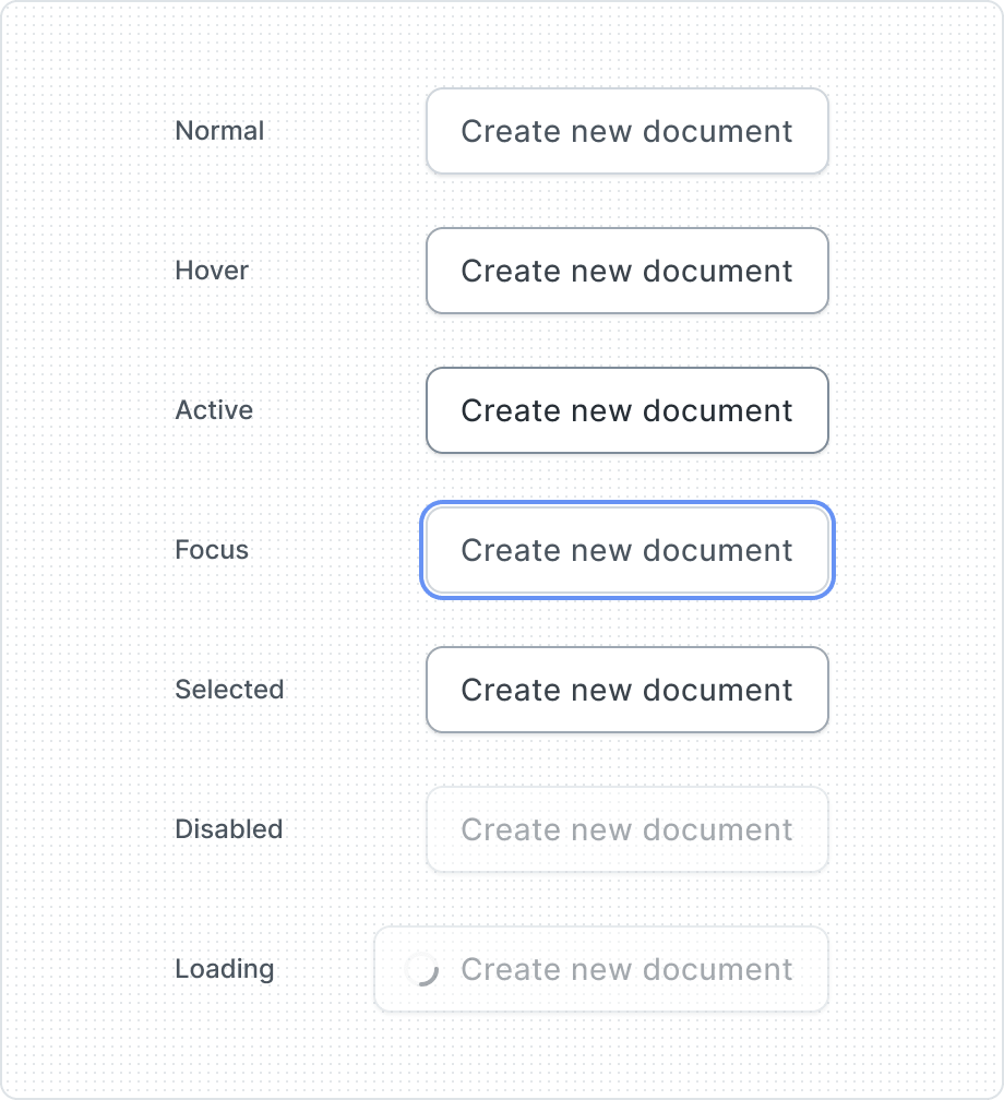
The button gives visual feedback and makes the user more aware of how to interact with the interface. That is why buttons have several different states, depending on their state of use.
| Property | Values | Default value |
|---|---|---|
Type | Default, Ghost, Bare | Default |
Appearance | Primary, Secondary, Inverted, Reverse Inverted | Secondary |
Intent | None, Success, Negative | None |
Size | Large, Medium, Small | Medium |
Before Icon | Yes/No | No |
After Icon | Yes/No | No |
Dropdown Indicator | Yes/No | No |
State | Normal, Hover, Active, Focus, Selected, Disabled, Loading | Normal |
Hierarchy
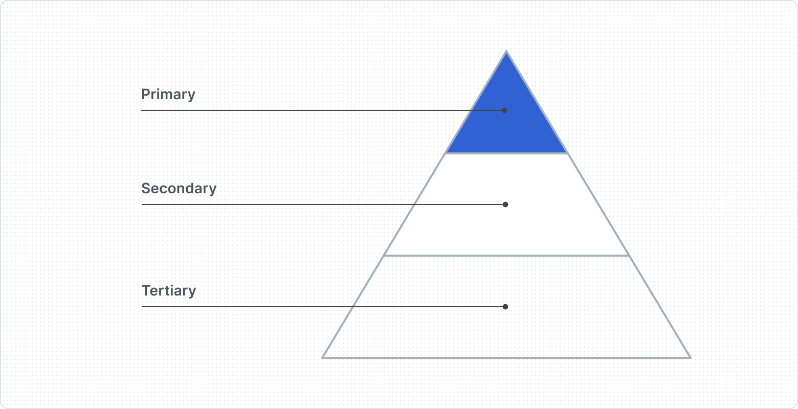
Primary - One important button
Type | Default |
Appearance | Primary, Inverted |
Secondary - Several regular buttons
Type | Default |
Appearance | Secondary |
Tertiary - Supporting buttons
Type | Ghost, Bare |
Appearance | Primary, Secondary, Inverted, Reverse Inverted |
Example
Anatomy
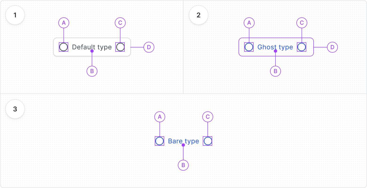
- Default type
- Before Icon
- Label
- After Icon
- Container
- Ghost type
- Before Icon
- Label
- After Icon
- Container
- Bare type
- Before Icon
- Label
- After Icon
Best Practices
Visual Hierarchy


Don’t overuse the buttons

Minimize icons in button


Content Guidelines
To the point


Precision


Clarity


Context

