Button Group
A set of related buttons that are visually and functionally grouped. Button Group acts as a cohesive unit, providing users with clear options for actions or navigation.

Variants
A Button Group is a set of related buttons, each one for a different action. It has three parts:
- First Item: The first action button in the group.
- Middle Item(s): These are extra buttons between the First and Last. They're optional.
- Last Item: The last action button in the group.
Each part is unique, but they work together as a group.

- First item
- Middle item
- Last item
Group

Button Groups are limited to 2-4 actions for usability. Use a dropdown indicator for more than 4 actions to maintain clarity and simplicity.

Size property adjusts Button Group dimensions (small, medium) to suit various contexts, improving visual hierarchy and enhancing user experience across different devices and screen sizes.
| Property | Values | Default value |
|---|---|---|
Items | 2, 3, 4 | 2 |
Size | Medium, Small | Medium |
Item

In Figma, we have three positions that represent placement in a Button Group.

Switch off label to presents a minimalist and visually engaging design, utilizing icons to represent different use cases such as Text Formatting.

The icon on the left draws the user's attention and allows for faster scanning and understanding of the meaning.

Indicates the presence of a dropdown menu or list when clicked. It is commonly used to provide access to additional options or actions.
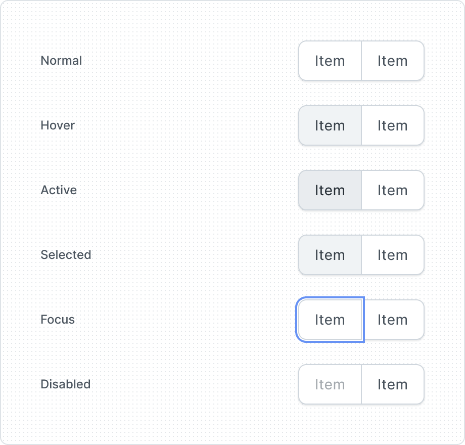
Item gives visual feedback and makes the user more aware of how to interact with the interface. That is why items have several different states, depending on their state of use.
| Property | Values | Default value |
|---|---|---|
Position | Start, Middle, Last | Start |
Label | Yes / No | Yes |
Before Icon | Yes / No | No |
Dropdown Indicator | Yes / No | No |
State | Normal, Hover, Active, Selected, Focus, Disabled | Normal |
Anatomy

- Before Icon
- Label
- Dropdown Indicator
- Container
Usage guidelines
Limit Button Group to 2-4 actions
This ensures usability and prevents user overwhelm, contributing to a clean and efficient interface. Using more than 4 actions at first glance may confuse users and clutter the UI. If you have more than four related actions, use a dropdown indicator. This maintains clarity, simplifies the interface, and facilitates informed decision-making.

