Counter
A numerical indicator displaying the current count of items, events, or actions. Counters can be used to show unread messages, items in a shopping cart, or other quantities that require the user’s attention.
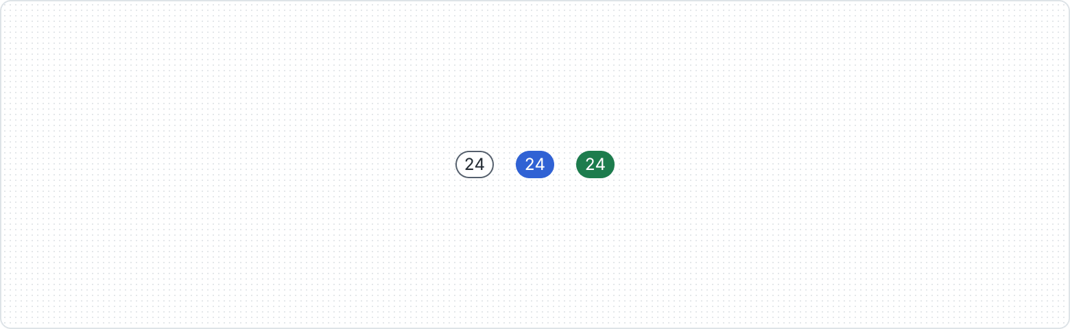
Variants

Counter offers different looks, each adding a unique touch. This variety makes your application look appealing and easier to understand.

Adaptable with two levels of emphasis - High and Low - allowing for clear prioritization within your application's communication.
| Property | Values | Default value |
|---|---|---|
Appearance | Default, Grey, Red, Blue, Green, Orange | Default |
Emphasis | High, Low | High |
Behaviors

The Counter always appears on circle elements at the top right corner with a -4px margin.

The Counter always appears on square elements at the top right corner.

When the number is more than 3 digits long, center the Counter on the right side of the component.

Center the Counter horizontally alongside related content.
Usage guidelines
Use only for numbers

