Radiobutton
A component that enables users to choose a single option from a set of mutually exclusive choices. Radio buttons provide clear visual feedback for the selected state, and are commonly used in forms and settings.

Key Features
- Interactive feedback
Responsive feedback for different interaction states, reassuring users of its functionality.
Variants
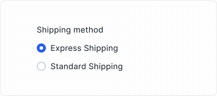
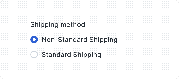
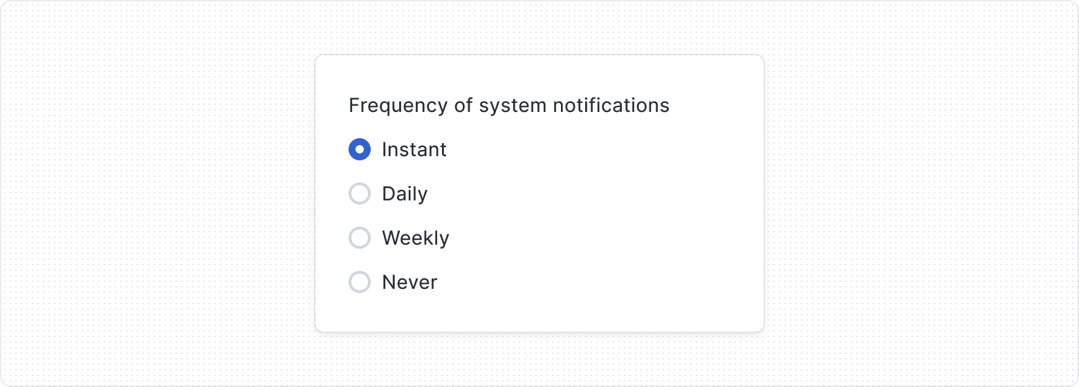
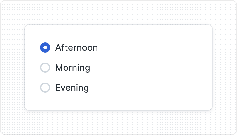
The Radio Button consists of three elements: Radio Button Control, Label, and Helper Text. The Radio Button serves as a visual cue for users when they alter its state by clicking or tapping.
The Label and Helper Text are optional, meaning you can choose to show or hide them as needed. The Label describes the Radio Button choice, while the Helper Text provides extra guidance.

- Radiobutton Control
- Label
- Helper Text

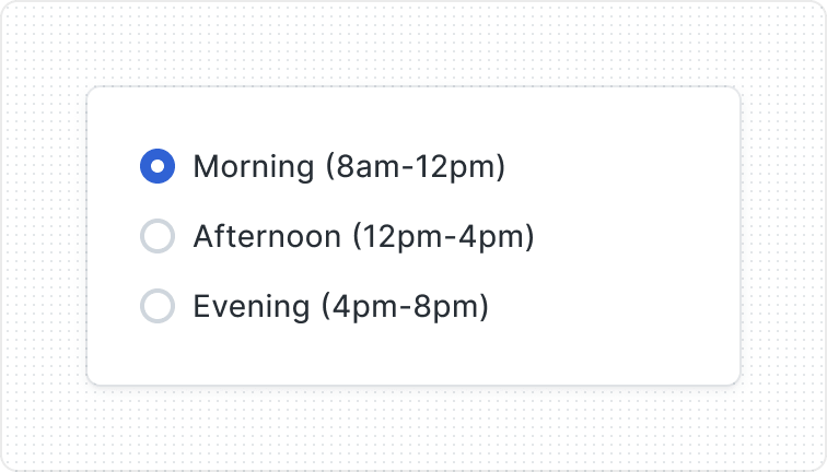
Features two variants - Unchecked and Checked - to effectively represent different selection states and facilitate user interactions within the interface.
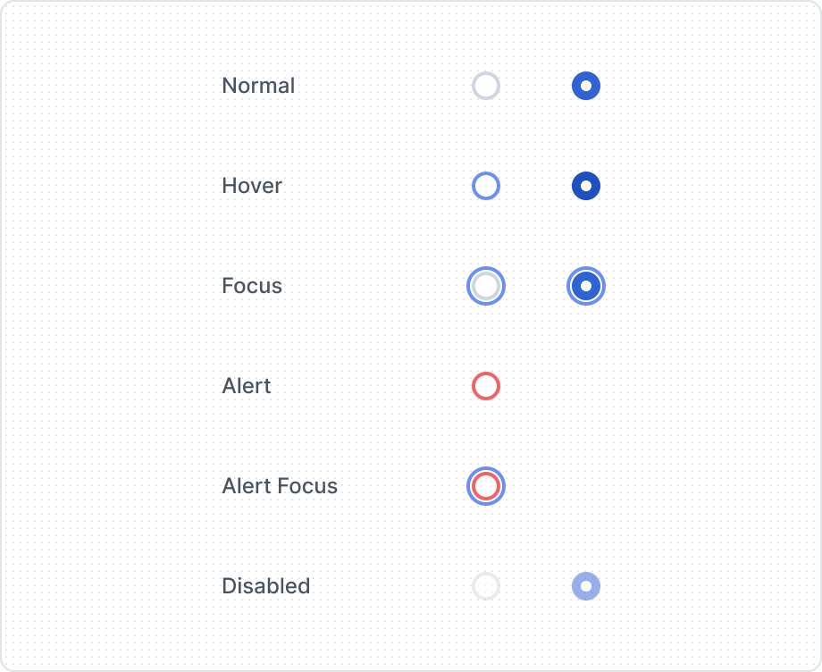
Provides visual feedback and enhances user awareness of interaction possibilities within the interface. Features multiple states, adapting to its current usage context.
| Property | Values | Default value |
|---|---|---|
Checked | Yes / No | No |
Label | Yes / No | No |
Helper Text | Yes / No | No |
State | Normal, Hover, Focus, Alert, Alert Focus, Disabled | Normal |
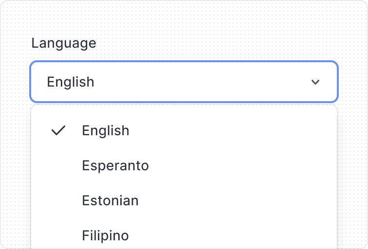
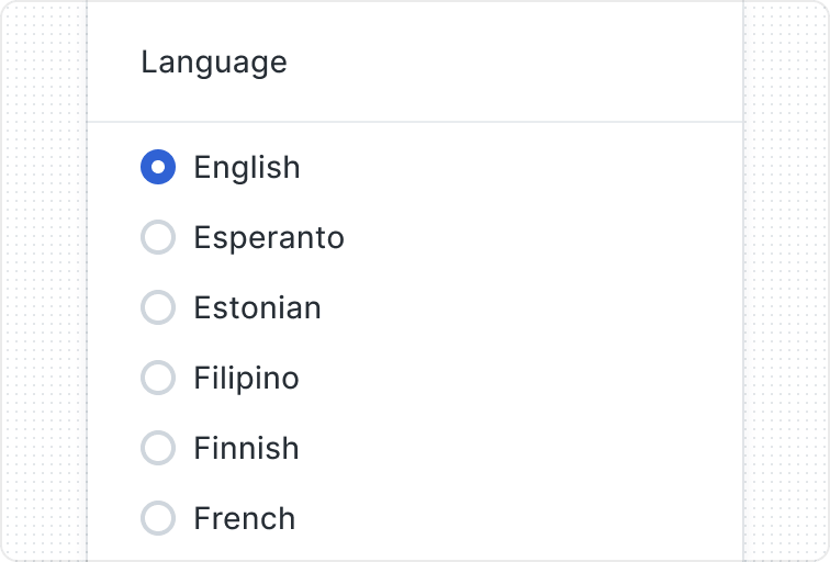
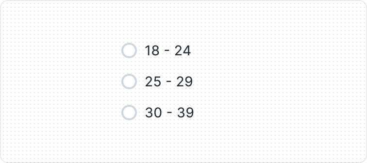
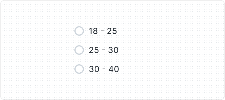
Grouping Options

Behaviors

When the text is too long for the available horizontal space, it wraps to another line.
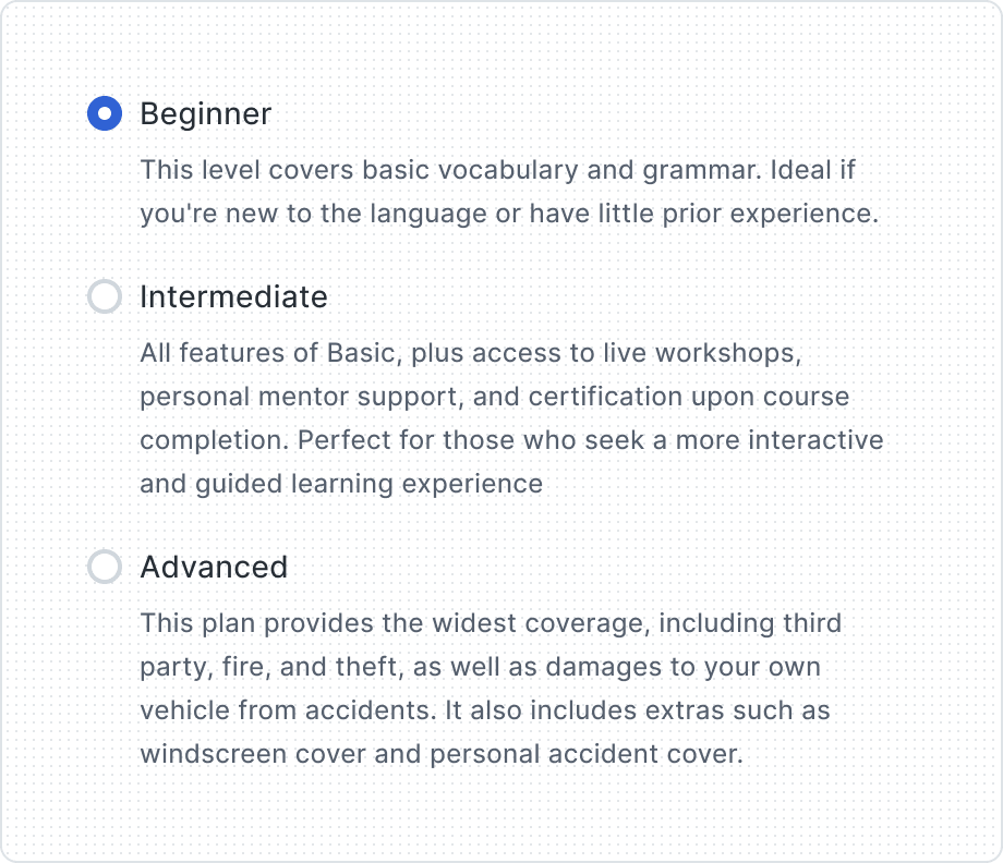
Use Helper Text if additional information is important and necessary to explain differences or to ensure that the user receives all the necessary information to take action.
Best Practices
Single selection

“None” option
Default option

Don’t overcrowd
Easy to scan
Content Guidelines
Carefully considered options
Keep labels clear