Badge
A small, visually distinct element used to display numbers, small pieces of information, or statuses. Badges are often paired with icons or other components to convey relevant information or updates.
Key Features
- Emphasis and Appearance
Three visual impact levels - High, Medium, and Low - and a comprehensive color palette, users can customize to fit various contexts, effectively conveying meaning while balancing attention and subtlety.
- Intent
Intent gives a meaningful voice to your messages. Five distinct styles - Negative, Positive, Neutral, Informative, and Warning - provide diverse semantic representation.
- Before and After Icon
Add before or after icon to enhance visual communication and context.
Variants
Badge offers different looks, each adding a unique touch. This variety makes your application look appealing and easier to understand.

Intent gives a meaningful voice to your messages.
- Neutral,
- Informative,
- Positive message,
- Warning,
- Negative.

Adaptable with three levels of emphasis - High, Medium, and Low - allowing for clear prioritization within your application's communication.

Badge supports icon placement to enhance message clarity and aesthetics. Labels are required for accessibility and comprehension.

Badges can be icon-only, perfect for small spaces. Include a tooltip on hover to clarify the icon's meaning.
| Property | Values | Default value |
|---|---|---|
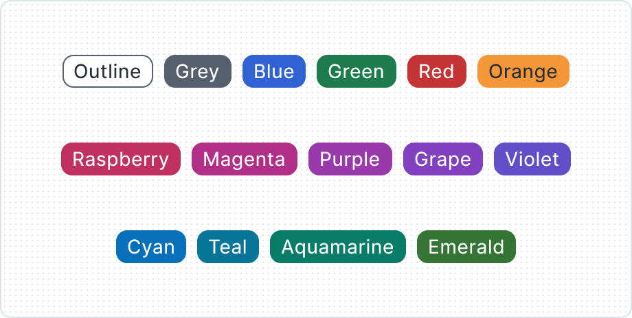
Appearance | Grey, Blue, Green, Red, Orange, Raspberry, Magenta, Purple, Grape, Violet, Cyan, Teal, Aquamarine, Emerald, Outline | Grey |
Intent | Negative, Neutral, Informative, Positive, Warning | Negative |
Emphasis | High, Medium, Low | High |
Label | Yes / No | Yes |
Before Icon | Yes / No | No |
After Icon | Yes / No | No |
Anatomy

- Before Icon
- Label
- After Icon
- Container
Best Practices
Don’t overuse the Badges


Select appropriate colors


Adapt to context with Before Icon