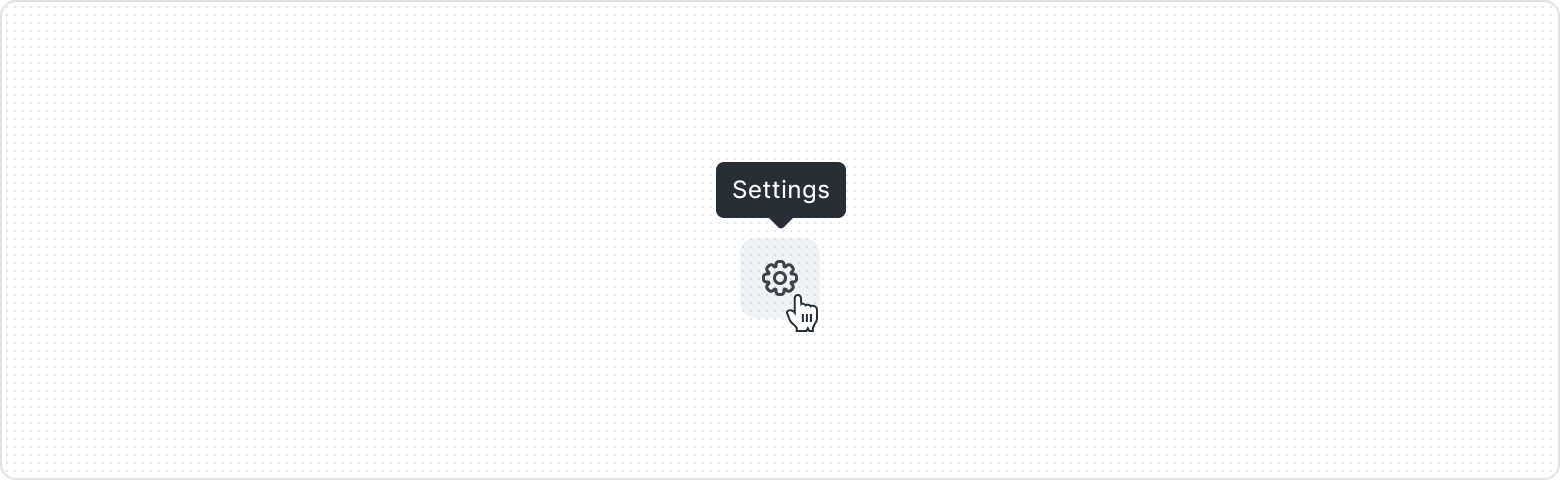
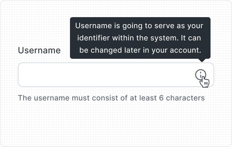
Tooltip
Brief, additional information or context that appears when the user hovers over or focuses on a particular element. Tooltips help provide explanations, hints, or tips without cluttering up the interface.
Key Features
- Manipulate position
Thanks to the available options for manipulating the positioning of the Tooltip and its arrowhead, there is no problem adapting it to a specific place on the layout.
Variants
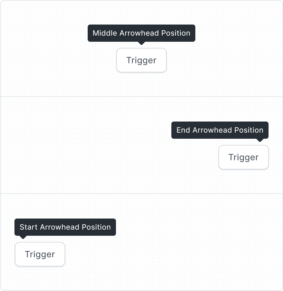
Arrowhead allows for a more precise indication of what the information refers to. Thanks to the option of selecting the arrowhead arrangement, it is possible to adapt the tooltip precisely to the specific component on the interface.

With four different options for Tooltip positioning, you can tailor the Tooltip to your project and make it fit best.
| Property | Values | Default value |
|---|---|---|
Arrowhead Position | Start, Middle, End | Middle |
Tooltip Position | Top, Bottom, Left, Right | Top |
Behaviors

The offset represents the gap between the tip's end and the target. While the default value is 4px, this should be modified with the specific case of the target.

To ensure that the tooltip remains within specified limits (for instance, within a browser window), a container and a respective container padding value can be set. The standard value for this padding is 16px.

When the text is too long for the available horizontal space, it wraps to form another line.
Anatomy

- Before Icon
- Label
- After Icon
Best Practices
For additional info


For Icon Button

Without actions

For shortcuts

Content Guidelines
Scannable text

