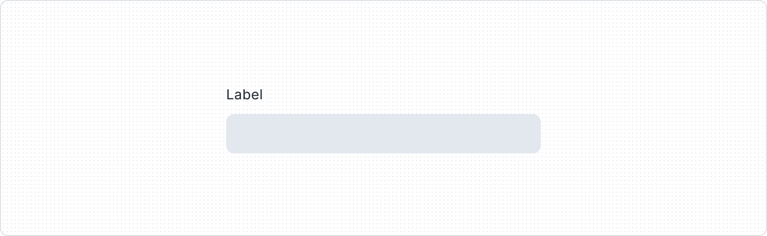
Label
A component that serves as a concise and informative identifier for various input elements, such as text fields, checkboxes, and radio buttons. It provides users with an understanding of the purpose and function of the associated input element, making it easier for them to interact with the form or interface. Labels play a critical role in enhancing usability, accessibility, and overall user experience.
Variants

Provides clear and concise descriptions for form elements or interactive components.

Label with Action integrates a button alongside the descriptive text, promoting user engagement and facilitating direct interaction with related form elements or components for an efficient user experience.

Tooltip Trigger is an interactive icon that allows users to access additional information or context by hovering or clicking. It enhances the user experience with supplementary guidance.

Optional text Indicates that certain form elements or components are not mandatory for form completion, providing users with clear guidance and flexibility to skip non-essential fields as needed.
| Property | Values | Default value |
|---|---|---|
Action | Yes / No | No |
Tooltip | Yes / No | No |
Optional | Yes / No | No |
Anatomy

- Label
- Label (Optional)
- Tooltip
- Bare Button
Behaviors

The Tooltip component activates when users hover or click on Icon, revealing a concise tooltip that offers additional information or context, enriching the user experience through on-demand guidance.

When the text is too long for the available horizontal space, it wraps to form another line.
Usage Guidelines
Plain language
Use simple language and familiar terminology to be inclusive - avoid using technical or business jargon or other complex terms your audience may not be familiar with.


Keep it simple
Avoid long Labels, preferably at most three words. If it is impossible, try to rephrase the label so that it takes up no more than a line of text. Remember that you can use a tooltip or helper text to add additional explanation.


Consistency
Keep the same style of labeling throughout the whole UI. Don't use any format other than sentence case (especially don't use all caps, as it can evoke negative emotions in the user). Also, don't use ":" at the end of the label.


Test
As often as possible, test your labels to make sure that the end user understands them the same way as you and does not waste time deciphering the command.
No articles
There is no need to use articles (the, a, and an) in Labels.