Tabs
A navigational component that organizes content into separate, switchable sections, making it easy for users to browse and access related information without navigating to a new page or view.
Key Features
- Two types
Features two unique styles, each designed to enhance the adaptability and aesthetic appeal of your user interface.
- Range wide of variants
Numerous variants are provided, offering the ability to customize Tabs by adding extra properties such as a Counter or Icons. You may also choose to use Icons exclusively.
Variants
Group

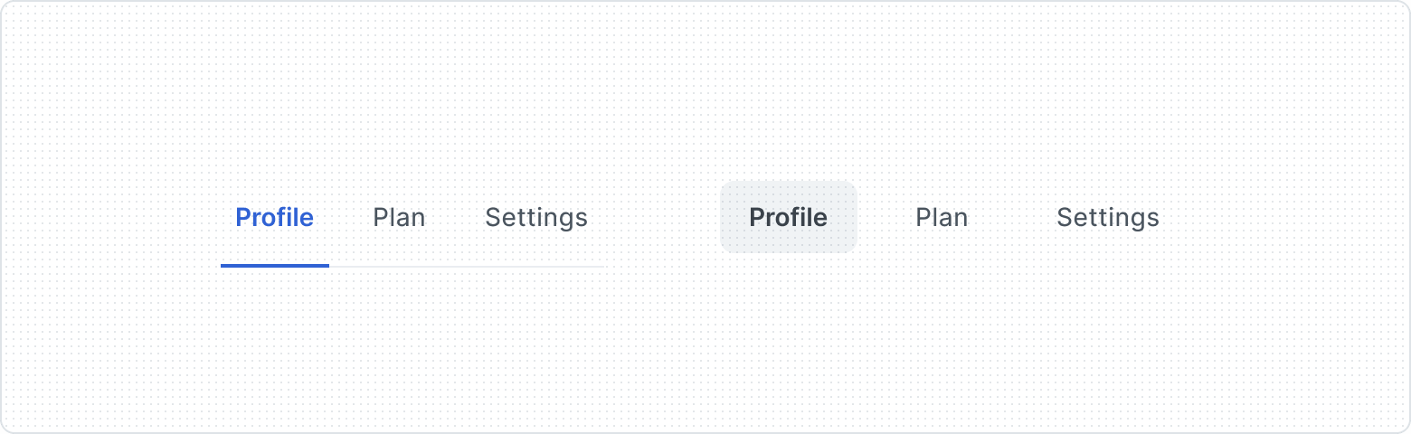
The Tab offers two distinct types - Default (top) and Ghost (bottom) to providing diverse visual styles and enhancing interface adaptability.

Supports varying densities, allowing for both compact and spacious layouts to accommodate different design requirements and preferences, ensuring a flexible and visually appealing navigation experience.
| Property | Values | Default value |
|---|---|---|
Compact | Yes / No | No |
Type | Default, Ghost | Default |
Tab Item

The icon on the left draws the user's attention and allows for faster scanning and understanding of the tab’s meaning.

Counter feature, displaying the number of items or notifications associated with each tab.

Presents a minimalist and visually engaging design, utilizing icons to represent different tabs, and streamlining navigation.
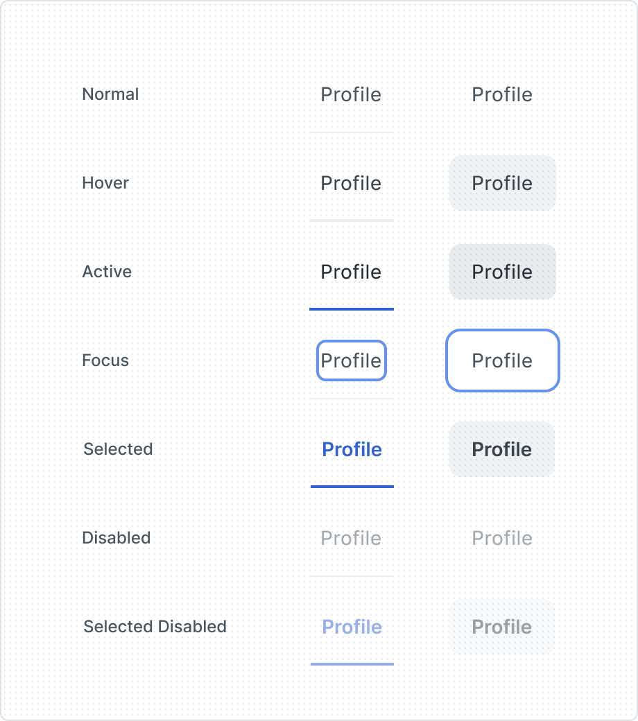
The Tabs delivers visual feedback and promotes user understanding of navigation options within the interface. That's why the Tab component showcases various states, reflecting its interaction context.
| Property | Values | Default value |
|---|---|---|
Only Icon | Yes / No | No |
State | Normal, Hover, Active, Focus, Selected, Disabled, Selected Disabled | Normal |
Before Icon | Yes / No | No |
Counter | Yes / No | No |
Anatomy
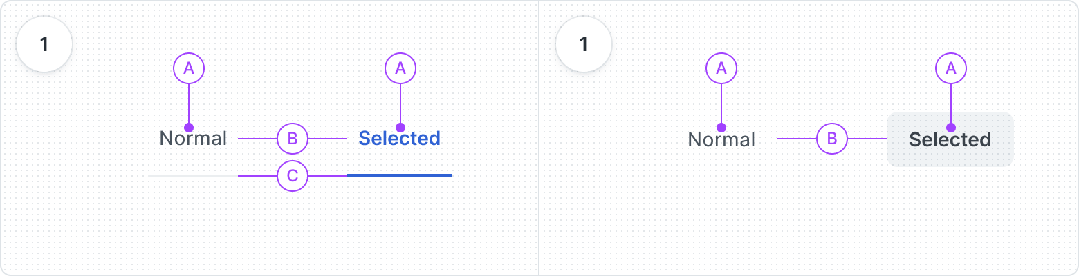
- Default type
- Label
- Container
- Bottom Border
- Ghost type
- Label
- Container
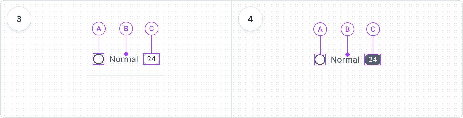
- Default type
- Before Icon
- Label
- Counter
- Ghost type
- Before Icon
- Label
- Counter
Best Practices
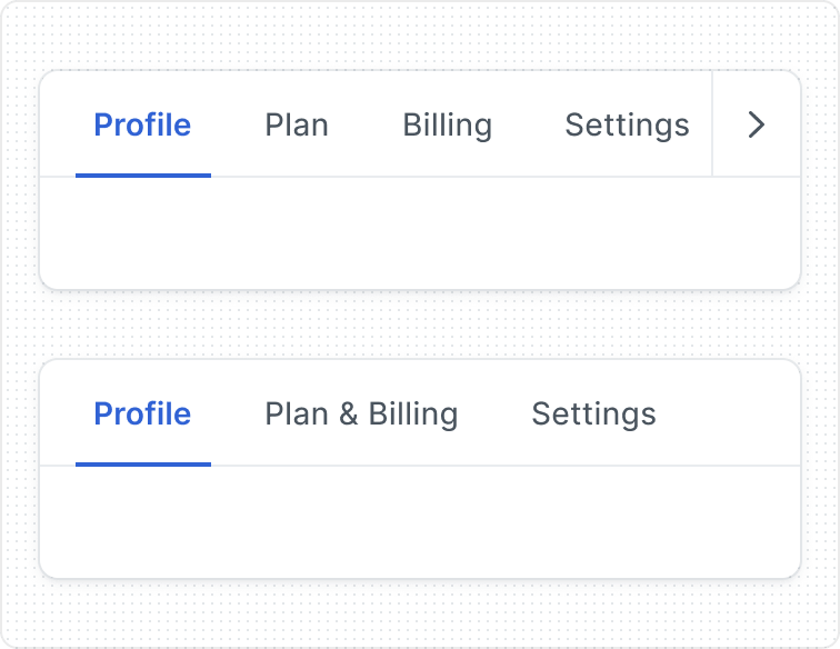
Too many Tabs
If you encounter a situation where the number of tabs exceeds the available horizontal space on the screen, you have two options: enable horizontal scrolling or use a subtle dropdown menu for all tab items. Avoid shortening several tab names just to accommodate them in the limited horizontal space.
The last solution could be combining tabs into one.

Arrange tabs in a logical order
Place the most frequently accessed or important tabs at the beginning of the tab list. Avoid arrange tabs randomly, making it difficult for users to predict or locate the desired content.
This helps users navigate more efficiently and find relevant content faster.


Content Guidelines
Keep labels clear

