Avatar
A visual representation of a user's identity, often displayed as a small image or initials. Avatars can be personalized with user-uploaded photos or auto-generated images and are commonly used in profile sections, comments, and messaging interfaces.

Key Features
- Range wide of variants
Numerous variants are provided, offering the ability to customize Avatar by adding extra Status Dot and change Appearance, Emphasis or Shape.
Variants
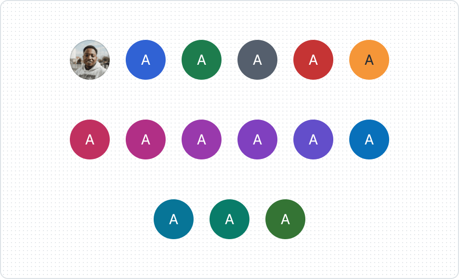
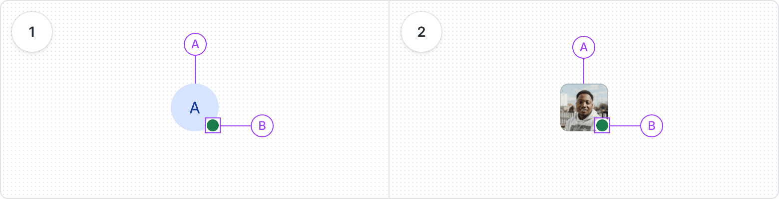
The color, along with the initial, allows for a unique avatar that facilitates user identification.
Use an avatar for a more personalized touch.

According to your needs, you can choose the emphasis of the avatar so that it matches the interface well.
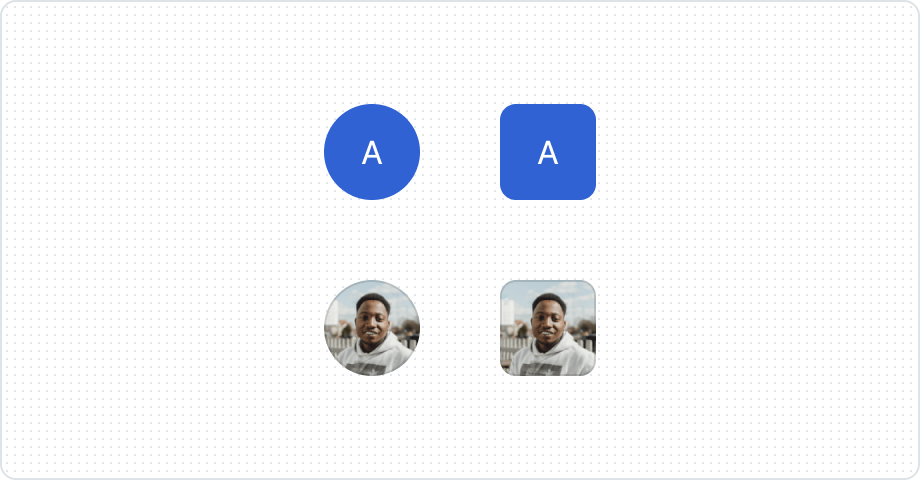
The different shapes give you the ability to better adapt to your design and maintain consistency.
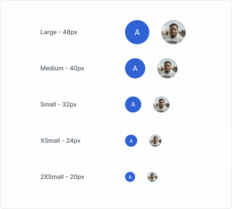
Different avatar sizes allow the hierarchy in the layout to be maintained and the design to be adapted to the device and screen size.
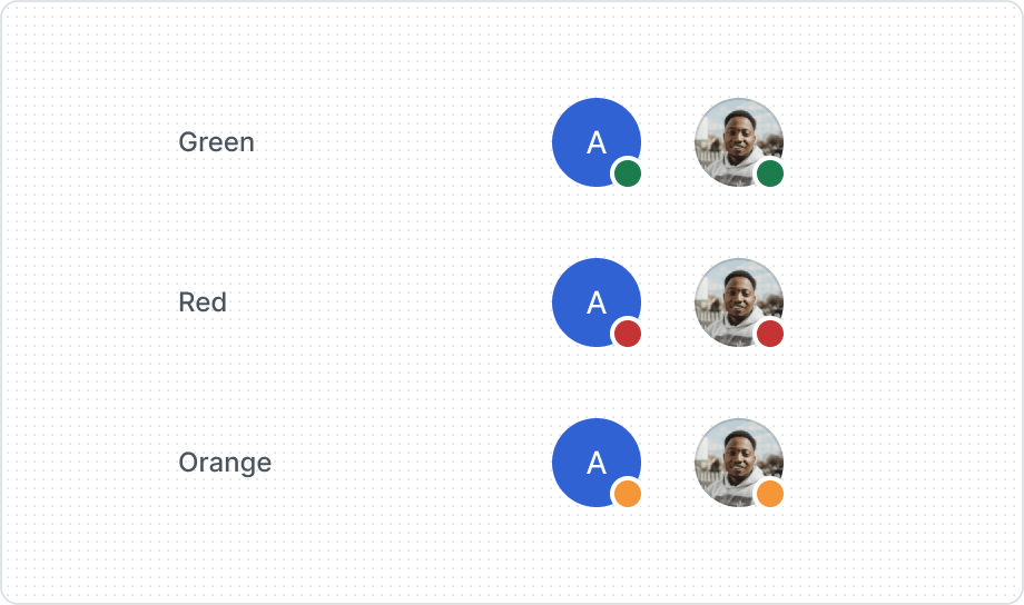
Three different appearances of the status dot allow the user to signify current status.
| Property | Values | Default value |
|---|---|---|
Appearance | Image, Blue, Green, Grey, Red, Orange, Raspberry, Magenta, Purple, Grape, Violet, Cyan, Teal, Aquamarine, Emerald | Image |
Emphasis | High, Low | Low |
Shape | Rounded, Square | Rounded |
Size | Large, Medium, Small, XSmall, 2XSmall | Large |
Status Dot | Yes / No | No |
Anatomy
- Default type
- Avatar
- Status Dot
- Square type
- Avatar
- Status Dot
Best Practices
Rounded or Square
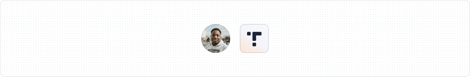
Image undefined

