Checkbox
A component that allows users to select one or multiple options from a set. Checkboxes present a clear visual indication of the selected state, making them ideal for forms and settings.

Key Features
- Indeterminate state
State represents a partial selection. It indicates that some, but not all, sub-options are selected, providing a clear and intuitive indication of complex selection scenarios.
- Interactive feedback
Responsive feedback for different interaction states, reassuring users of its functionality.
Variants
The Checkbox is created with three parts: Checkbox Control, Label, and Helper Text. The Checkbox Control is an indicator for users when they change state by clicking or tapping.
The Label and Helper Text are optional, meaning you can choose to show or hide them as needed. The Label describes the checkbox choice, while the Helper Text provides extra guidance.

- Checkbox Control
- Label
- Helper Text

Offers three distinct variants - Unchecked, Checked, and Indeterminate - to clearly represent different selection states and accommodate diverse user interactions within the interface.

Provides visual feedback and enhances user awareness of interaction possibilities within the interface. That's why the Checkbox component features multiple states, adapting to its current usage context.
| Property | Values | Default value |
|---|---|---|
Variant | Unchecked, Checked, Indeterminate | Unchecked |
Label | Yes / No | No |
Helper Text | Yes / No | No |
State | Normal, Hover, Focus, Alert, Alert Focus, Disabled | Normal |
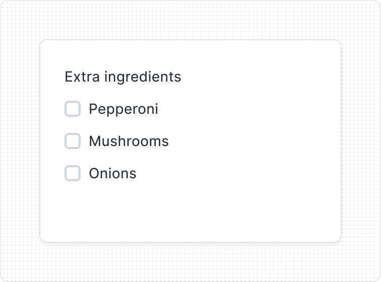
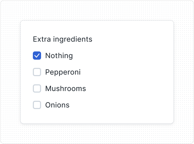
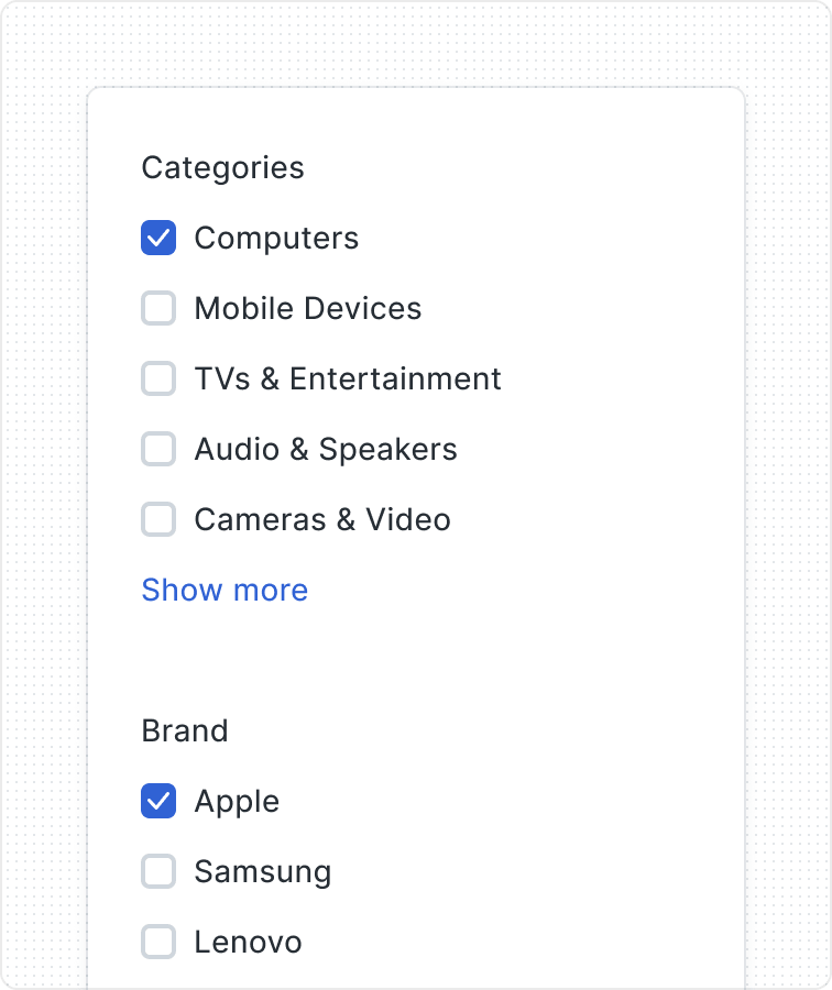
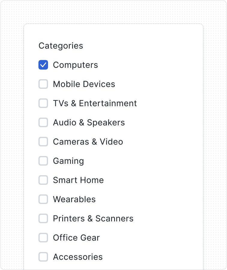
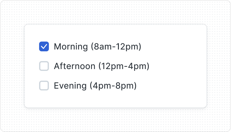
Grouping Options

Behaviors
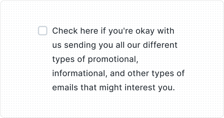
When the text is too long for the available horizontal space, it wraps to another line.

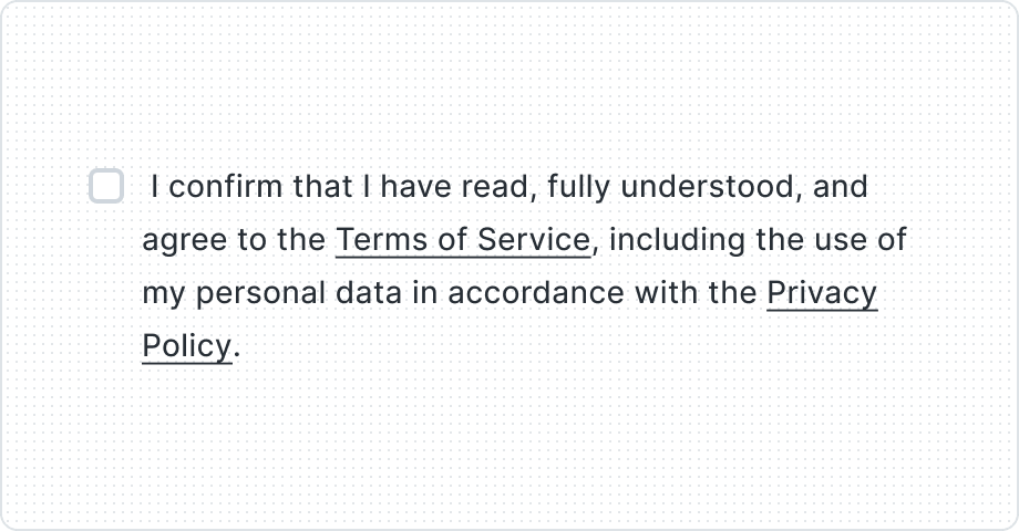
Use Helper Text if additional information is important and necessary to explain differences or to ensure that the user receives all the necessary information to take action.
Best Practices
Multiple choice
Progressive disclosure
Easy to scan

Content Guidelines
Keep labels clear

Be consistent


Positive wording

