Select
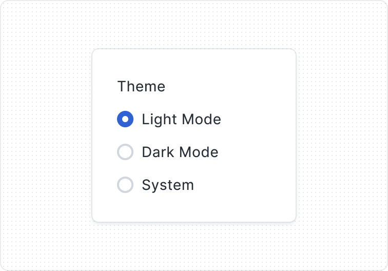
A component that allows users to choose one or more options from a list, typically presented as a dropdown or pop-up menu. Select components are commonly used in forms and settings.

Key Features
- Clear input button
A Visually recognizable clear input button, featuring an X icon, is placed within the text input field, allowing users to clear the entered text effortlessly.
- Select validation states
Features multiple visual states to provide users with instant feedback on their input status and any necessary corrections.
Variants
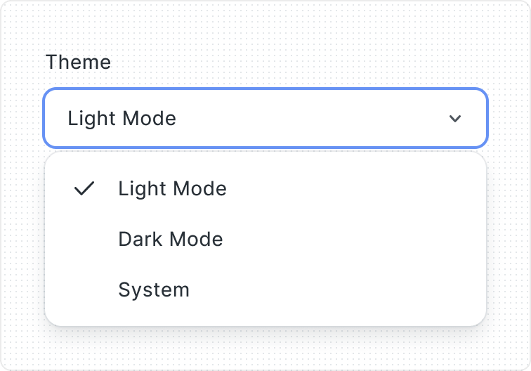
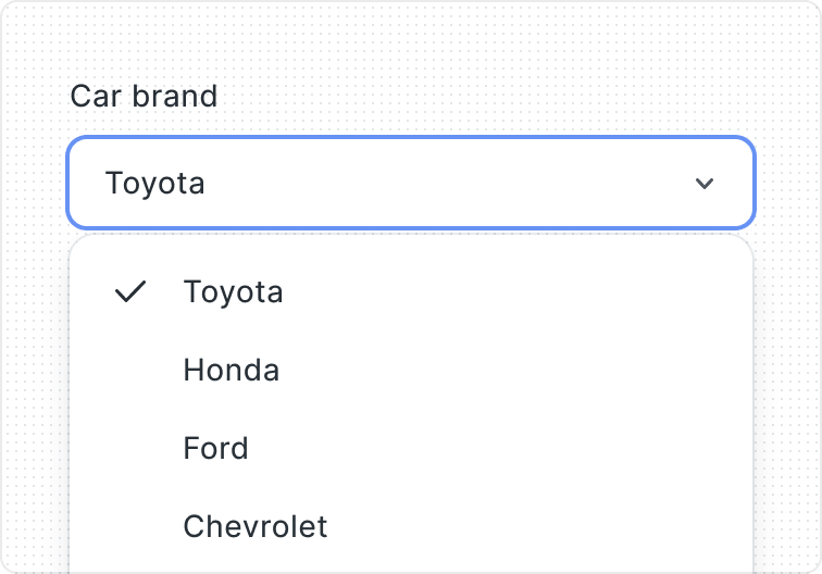
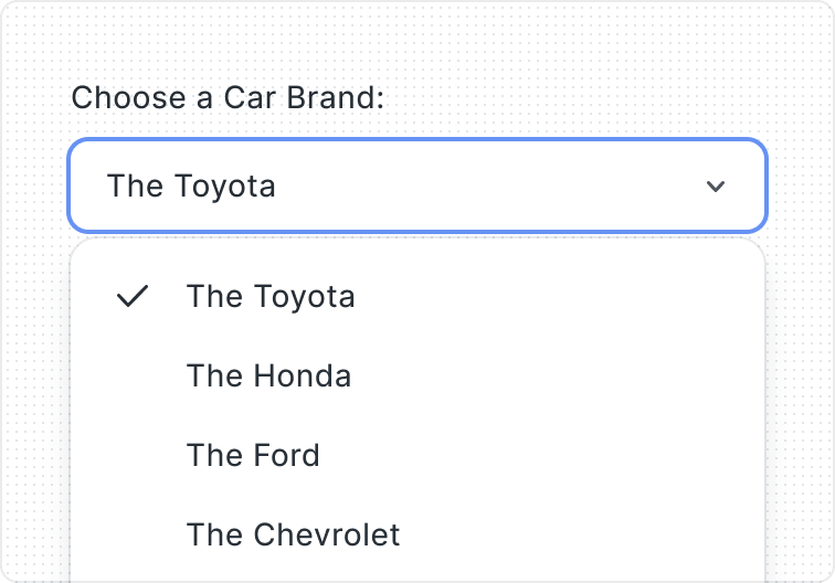
The Select consists of three parts: Label, Field, and Helper Text. The Label informs users what to choose, the Field is where they make their selection, and the Helper Text provides additional guidance.
You can choose to show or hide the Label and Helper Text to fit your design. This flexibility helps create an easy-to-use Select component.

- Label
- Field
- Helper Text

Choose from three options - None, Icon, or Avatar - to customize the content preceding the component, enriching the visual presentation and context.
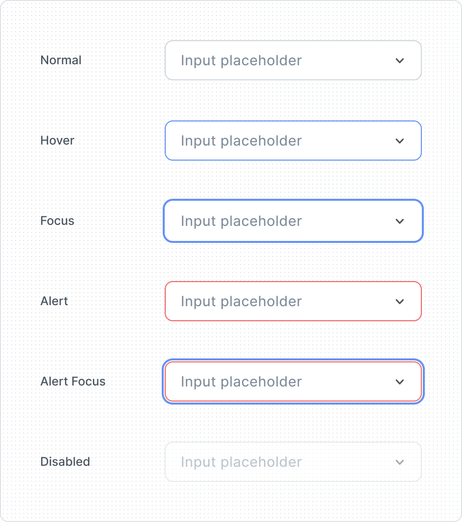
Give visual feedback and make the user more aware of how to interact with the interface. That is why Select have several different states, depending on their state of use.
Represent a completed or active element, offering clear visual feedback that signifies user interaction or selection within the interface.

A Visually recognizable clear input button, featuring an "X" icon, is placed within the select field, allowing users to clear the entered text effortlessly.
| Property | Values | Default value |
|---|---|---|
Filled | Yes / No | No |
Clear Button | Yes / No | No |
Before Component | None, Icon. Avatar | None |
State | Normal, Hover, Focus, Alert, Alert Focus, Disabled | Normal |
Anatomy
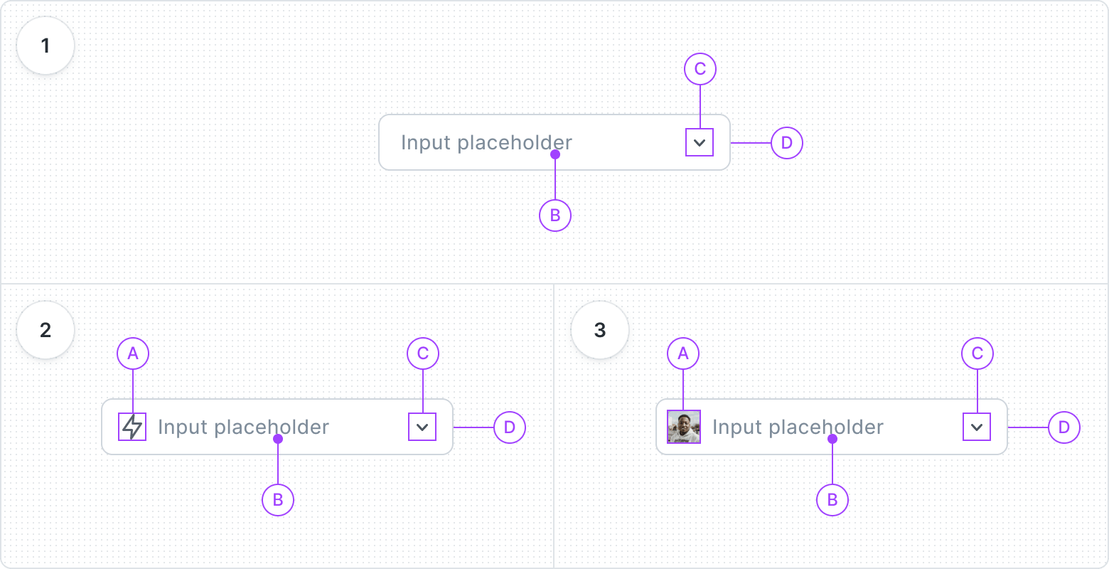
- None
- Label
- Arrow
- Container
- Icon
- Before Icon
- Label
- Arrow
- Container
- Avatar
- Avatar
- Label
- Arrow
- Container
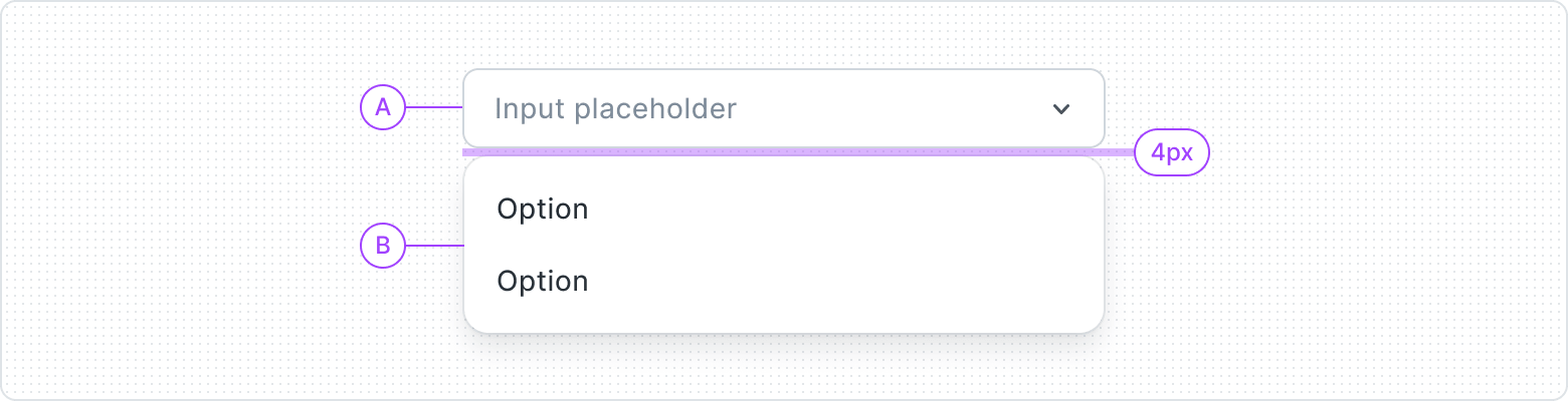
- Select
- Dropdown
Behaviors

When the Select is opened it integrates with the Dropdown, providing a smooth and intuitive user experience for selecting options.

In the event of an error, the component transforms into an error state, displaying a Helper Text with Before Icon and Error Intent, guiding users towards resolution.
Best Practices
Don’t overcrowd
Default option


Content Guidelines
Clear and concise labels


Consistency
“None” option
Helper text