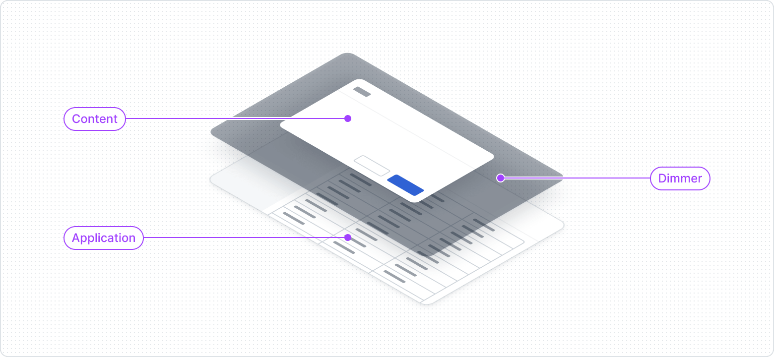
Dimmer
An overlay that darkens the background content to focus the user's attention on another specific element or interaction, such as a Modal or Side Panel.
Displaying
The main goal of using the Dimmer is to draw attention to the content displayed above it. The Dimmer doesn't appear alone. In terms of z-index, the Dimmer is layered between the entire application and the content.
Usage guidelines
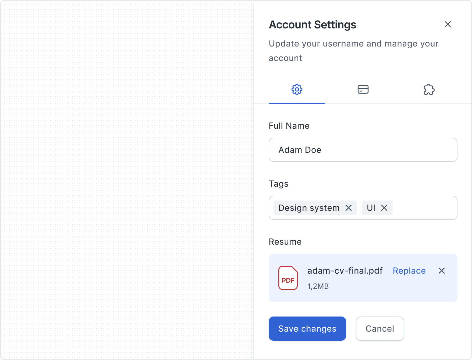
Dialog
A temporary, focused window that overlays the main content. Often used to prompt user input or present important information that requires interaction, such as confirmation or error messages.

Side Panel
Appears alongside the main content and is typically related to supporting actions, navigation, settings, or displaying supplementary information relevant to the current context or user task.