Breadcrumbs
A element allow to displays the user's current location within a website or application. Breadcrumbs use a hierarchical structure to show the path taken and provide a way to navigate back to previous levels.

Variants
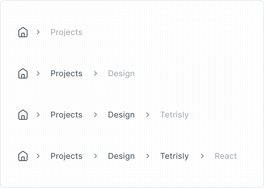
The Breadcrumbs component is made up of three other components:
- Icon Button, as an indicator of the Homepage,
- Button, as a breadcrumbs item,
- Icon, as a separator between breadcrumbs items.

- Icon Button
- Button
- Icon
Premade item variants are optimized templates that enhance user experience, promote best practices, and minimize implementation errors.
| Property | Values | Default value |
|---|---|---|
Items | 1, 2, 3, 4, More than 5 | 2 |
Behaviors
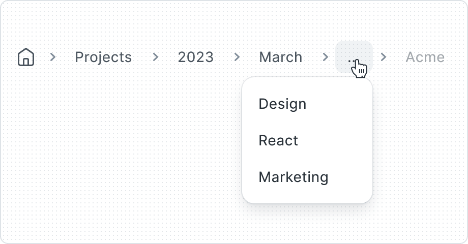
Sometimes Breadcrumbs have many items and may need to be truncated when there isn't enough space to display all levels of the breadcrumb list. In this case use 'More than 5’ option.
Best Practices
Don’t overuse the Badges


Truncating


Using icons in Breadcumbs

Use breadcrumbs to show hierarchy
Breadcrumbs should have form of navigating a linear hierarchy. This is important because they help users understand where they are and how they got there.
They should not be used for other interactions, like showing filters or navigation.