Helper Text
A component that provides additional guidance or instructions to users for completing form fields or input elements. It serves as a supplementary resource to clarify the expected input, format, or constraints, thereby improving user comprehension and reducing the likelihood of input errors.
Variants
Features three distinct intents - Neutral, Alert, and Success - to convey the appropriate message or feedback, guiding users and enhancing the overall experience through clear and context-specific communication.
The icon on the left draws the user's attention and allows for faster scanning and understanding of the text meaning.
Optional counter indicator, providing real-time character or item count information to users, promoting awareness of input limitations.
| Property | Values | Default value |
|---|---|---|
Intent | None, Alert, Success | None |
Before Icon | Yes / No | No |
Counter | Yes / No | No |
Anatomy
- Icon
- Label
- Counter
Behaviors
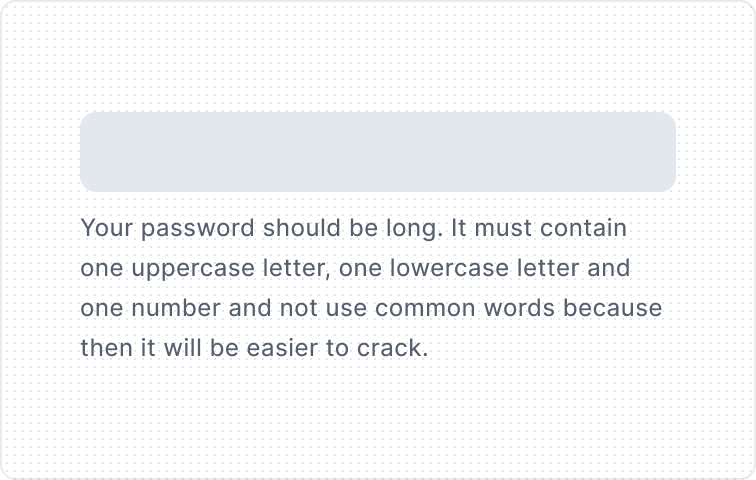
When the text is too long for the available horizontal space, it wraps to form another line.
Usage Guidelines
Be specific
Helper text should be brief and precise. Avoid lengthy explanations that could overwhelm the user. Use concrete numbers if possible.

Plain language
Ensure the text is easy-to-understand and can actually reach all users, avoid jargon, and be inclusive.
Provide guidelines and examples
In the helper text, you can both offer examples of the type of input that is expected and give additional guidelines.
Full sentences
Use complete sentences, sentence-style capitalization, and punctuation.
Alert Helper text
Use Alert Helper text to communicate an error. Explain the error as clearly as possible, and suggest a solution to fix it.
In the error message, try not to focus on what the user has done wrong but emphasize the success guidelines. Use helpful language and tone. Don’t write all caps and avoid punctuation marks so as not to increase the negative feelings of the user.
As alert text replaces helper text, it is worth remembering that they must be consistent with each other and contain the same key guidelines.
