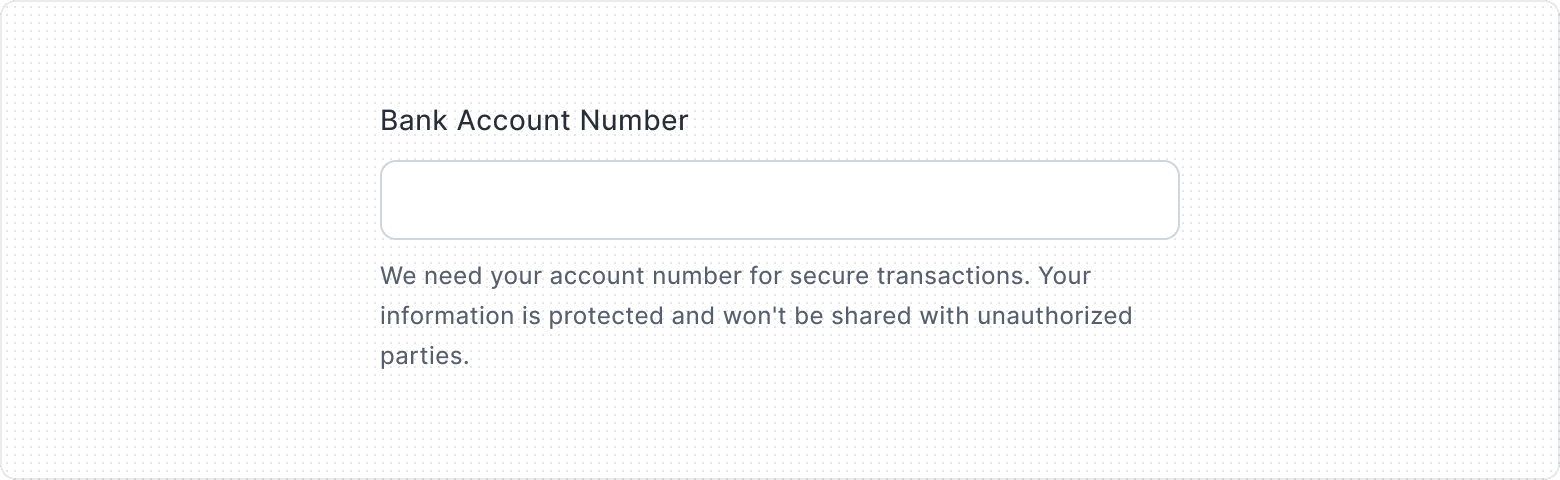
Text Input
A versatile and interactive element. Buttons allow users to perform actions and navigate through an application. They come in various styles and sizes, providing clear visual cues and feedback to users.
Key Features
- Clear button
A Visually recognizable clear button, featuring an X icon, is placed within the text input field, allowing users to clear the entered text effortlessly.
- Input validation states
Features multiple visual states to provide users with instant feedback on their input status and any necessary corrections.
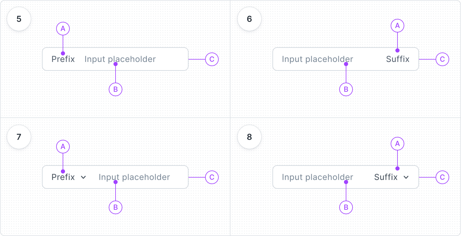
- Affixes
Provided Text or dropdown prefixes and suffixes to guide users to enter information in the correct format.
Variants
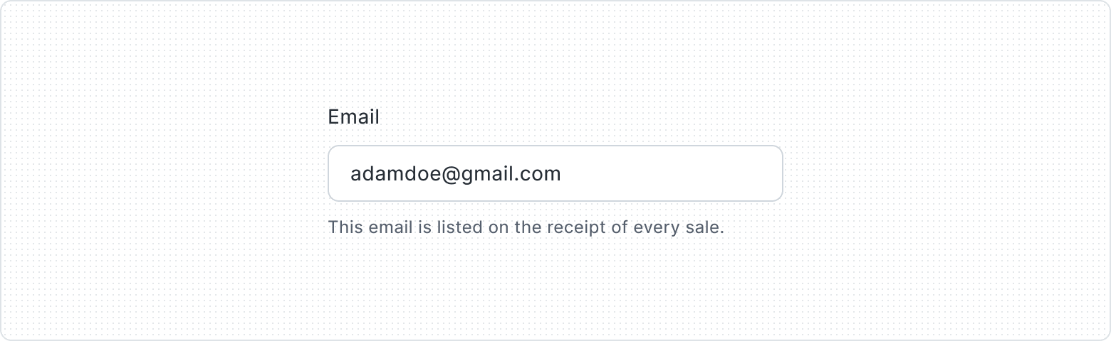
The Text Input component is made up of three parts: Label, Field, and Helper Text. The Label tells users what to enter, the Field is where they type, and the Helper Text gives extra guidance.
You can choose to show or hide the Label and Helper Text to fit your design. This flexibility helps create an easy-to-use Text Input component.

- Label
- Field
- Helper Text
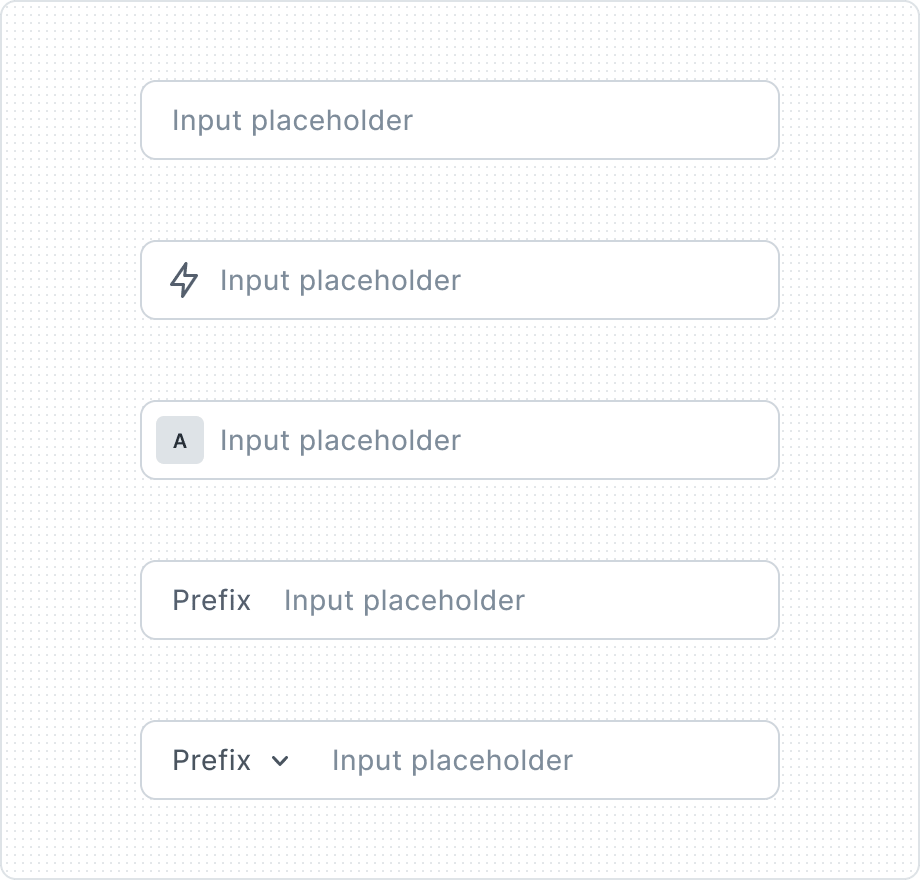
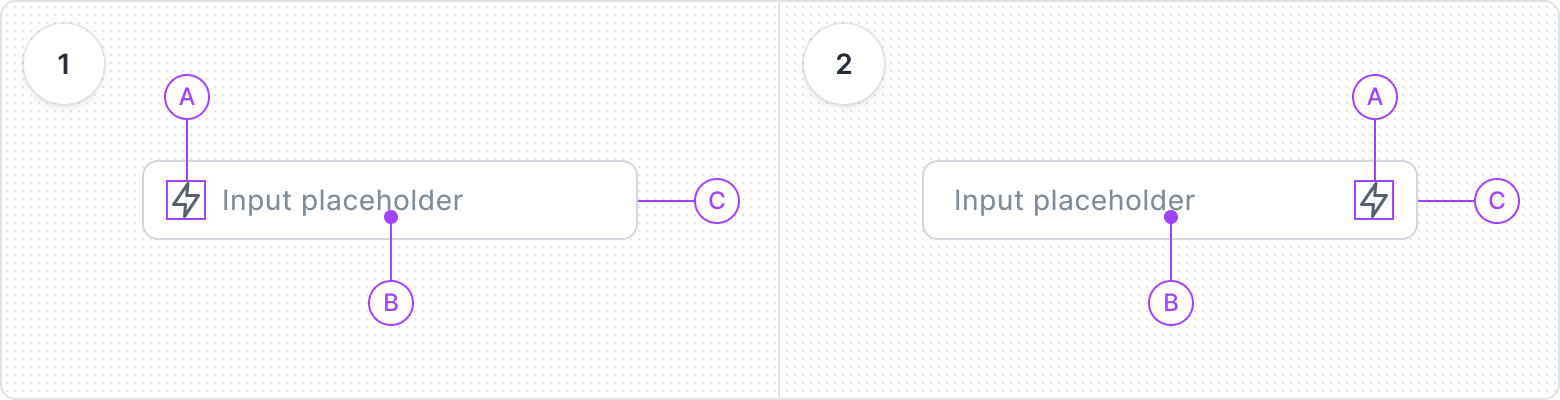
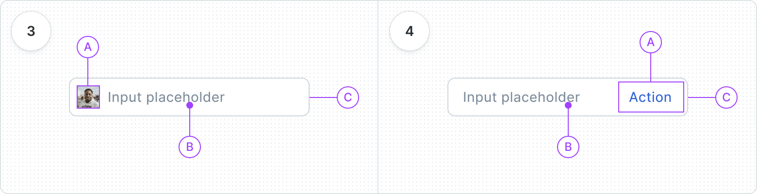
Choose from five options - None, Icon, Avatar, Text Prefix, or Dropdown Prefix - to customize the content preceding the component, enriching the visual presentation and context.
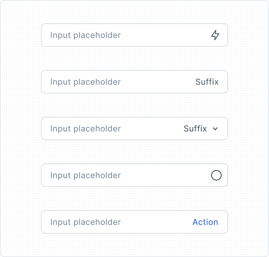
Choose from five options - None, Icon, Avatar, Text Suffix, or Dropdown Suffix - to customize the content preceding the component, enriching the visual presentation and context.
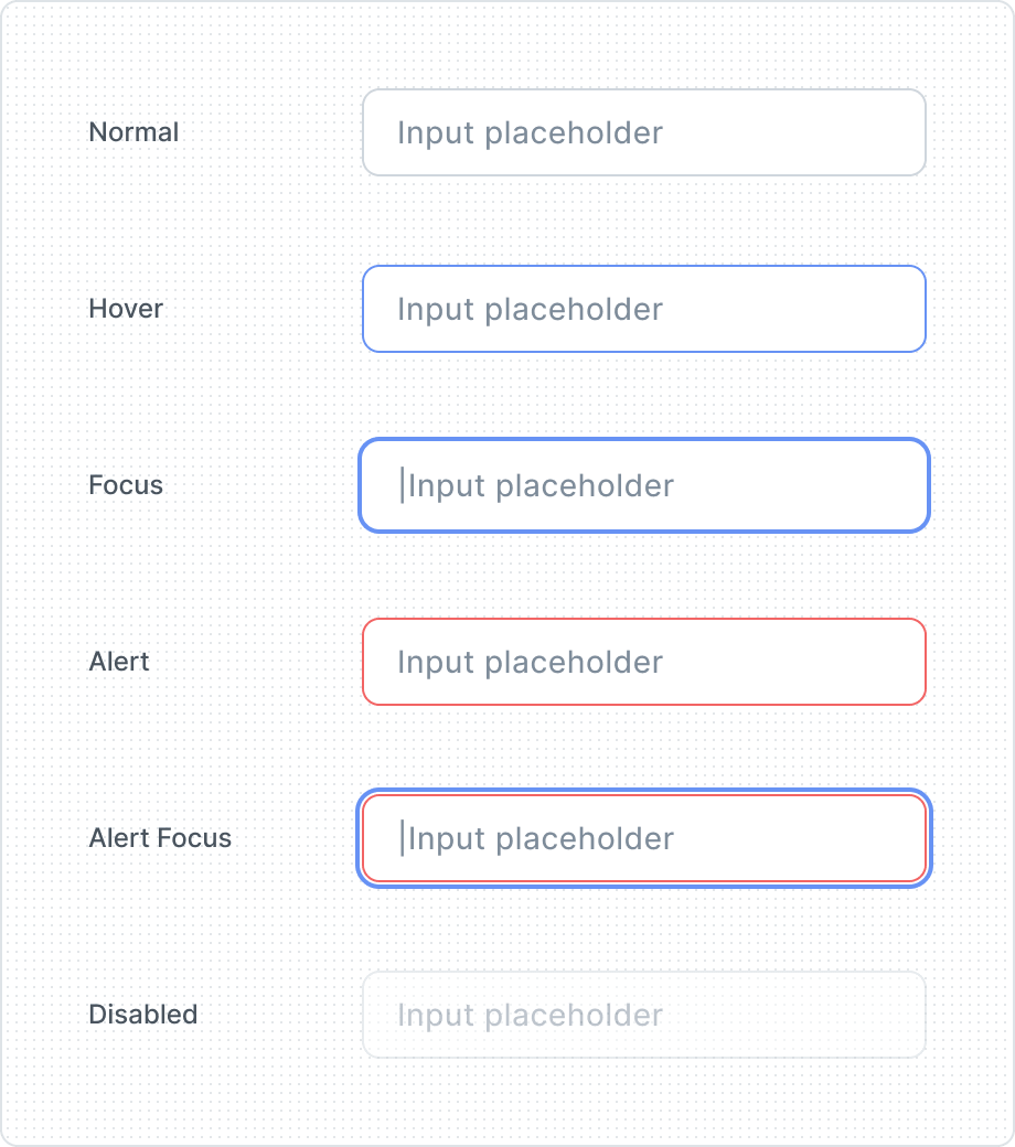
Gives visual feedback and makes the user more aware of how to interact with the interface. That is why Text Input have several different states, depending on their state of use.
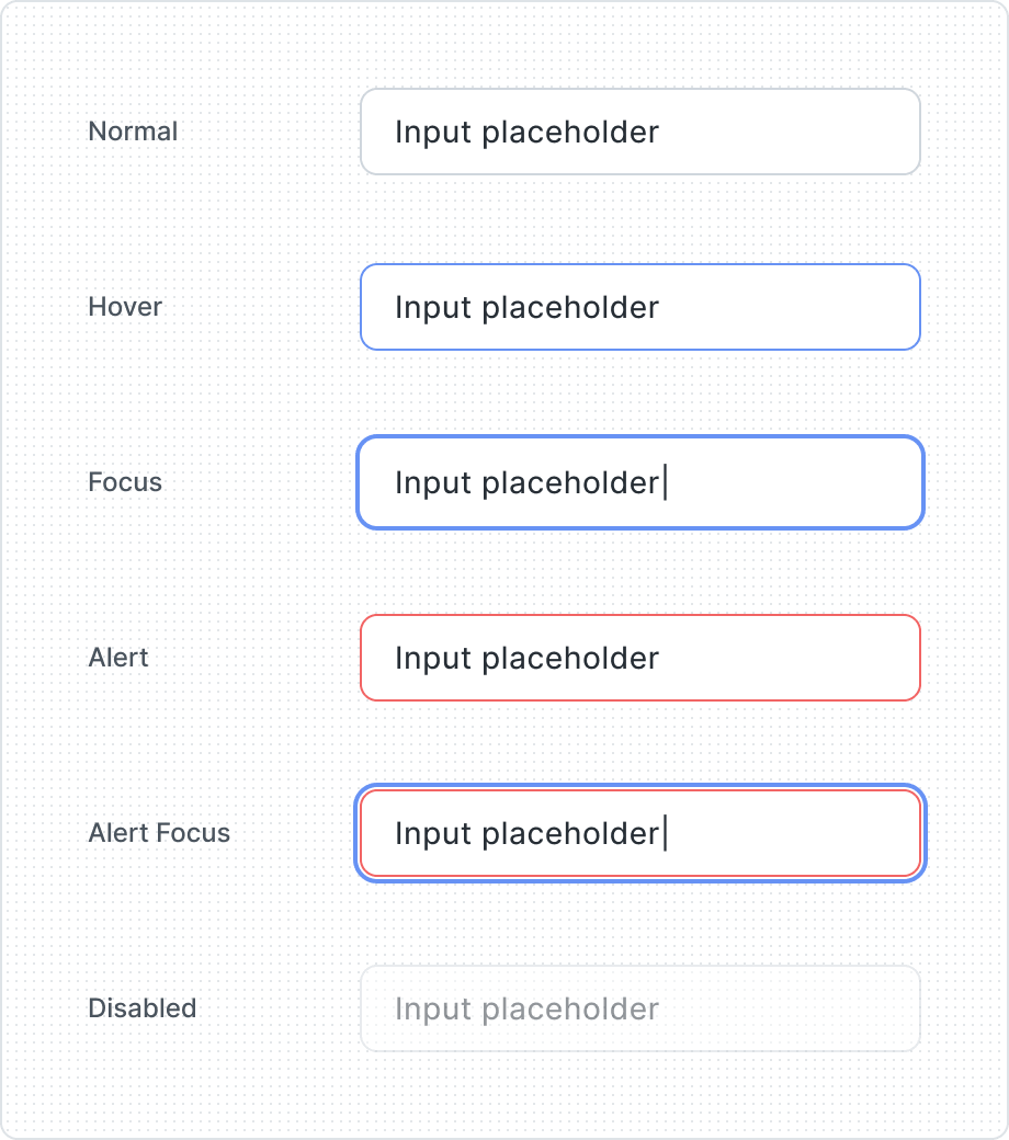
Represent a completed or active element, offering clear visual feedback that signifies user interaction or selection within the interface.

A Visually recognizable clear button, featuring an "X" icon, is placed within the text input field, allowing users to clear the entered text effortlessly.
| Property | Values | Default value |
|---|---|---|
Filled | Yes / No | No |
Clear Button | Yes / No | No |
Before Component | None, Icon. Avatar, Text Prefix, Dropdown Prefix | None |
After Component | None, Icon, Text Suffix, Dropdown Suffix, Icon Button, Button | None |
State | Normal, Hover, Focus, Alert, Alert Focus, Disabled | Normal |
Anatomy
- Before Icon
- Before Icon
- Label
- Container
- After Icon
- After Icon
- Label
- Container
- Avatar
- Avatar
- Label
- Container
- Action
- Button or Icon Button
- Label
- Container
- Prefix
- Text Prefix
- Label
- Container
- Suffix
- Text Suffix
- Label
- Container
- Dropdown Prefix
- Dropdown Prefix
- Label
- Container
- Dropdown Suffix
- Dropdown Suffix
- Label
- Container
Behaviors

In the event of an error, the component transforms into an error state, displaying a Before Icon and Helper Text with Error Intent, guiding users towards resolution.
Best Practices
Sensitive data input explained
Placeholder text


Essential information
Don’t overcrowd
Content Guidelines
Clear label


Watch out labelling verbs

Error message with a tip


Helper text when it actually helps

